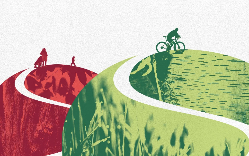
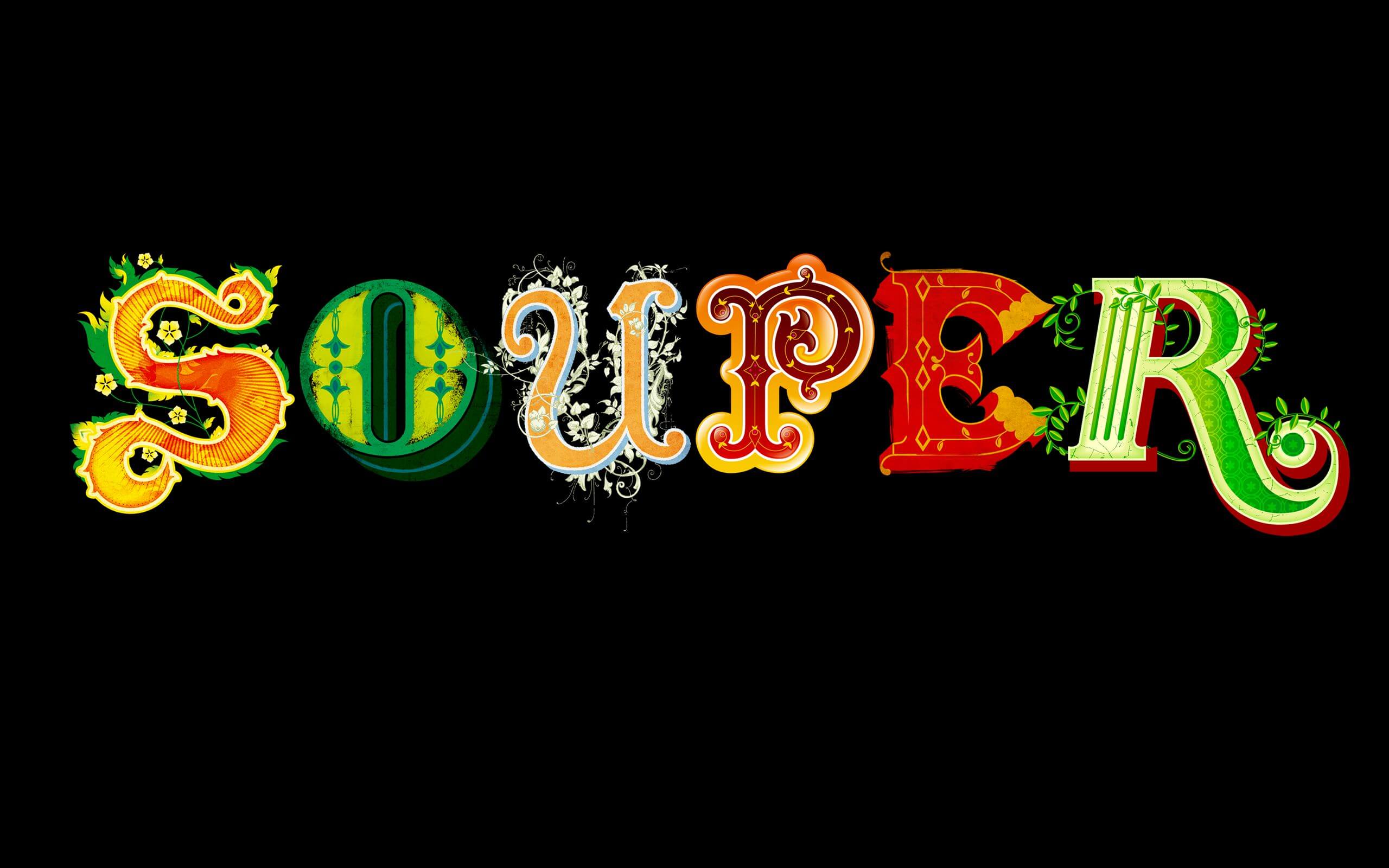
The A-Z of global flavours
Glorious! Soups
Designed at
Lambie-Nairn
Industry
Food
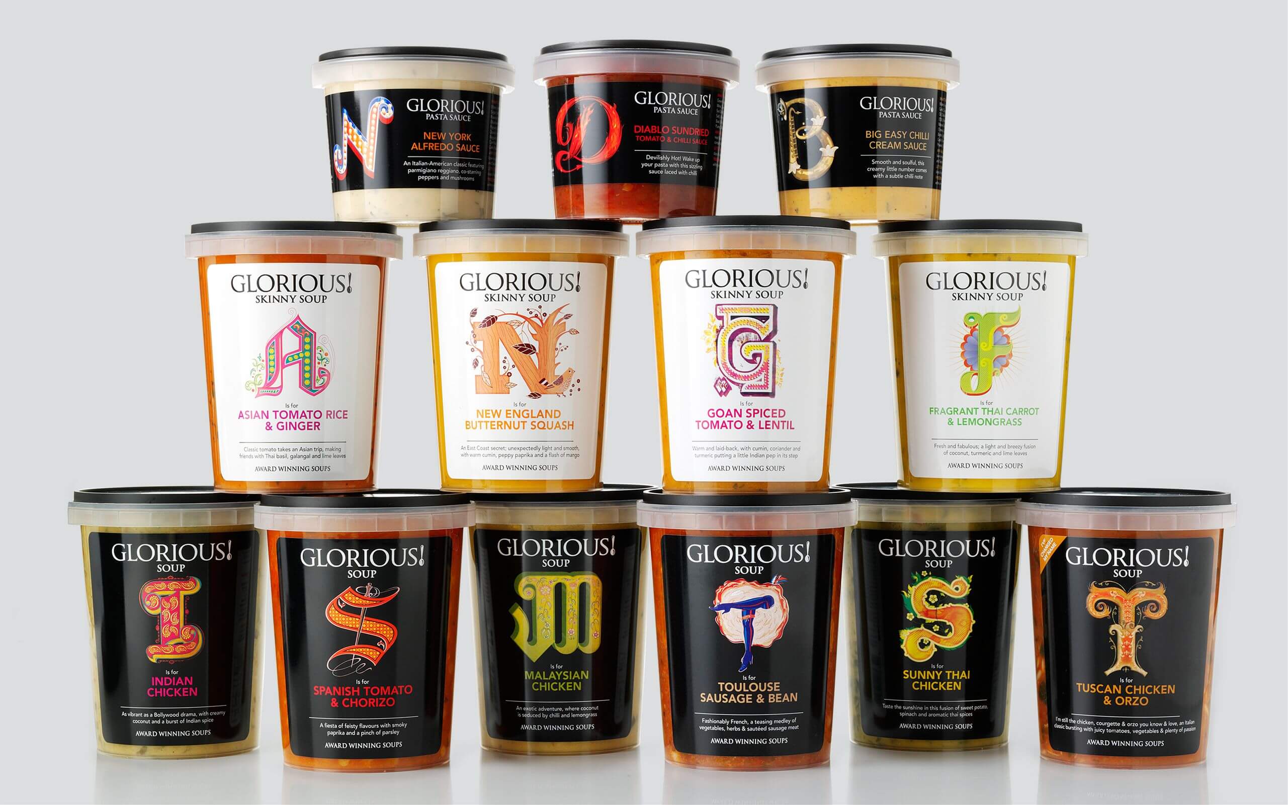
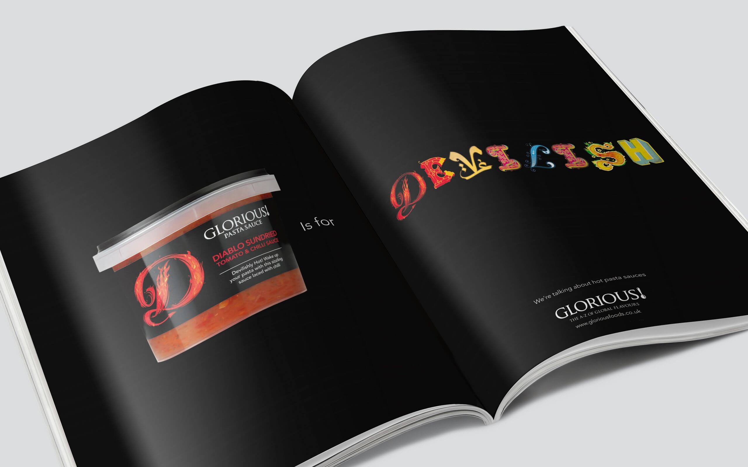
Glorious! Soups
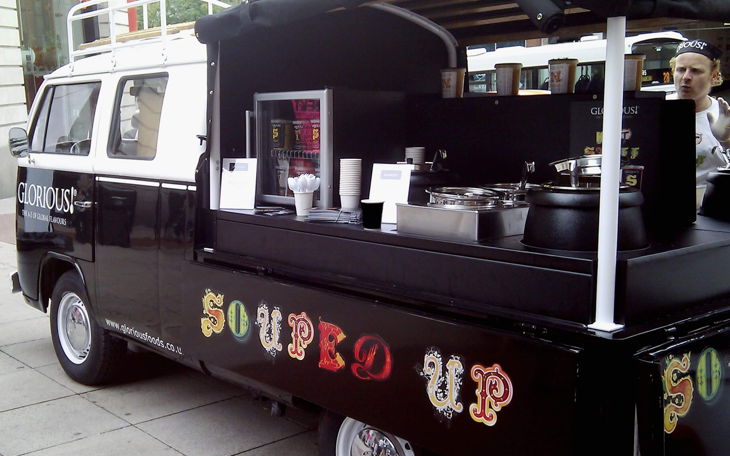
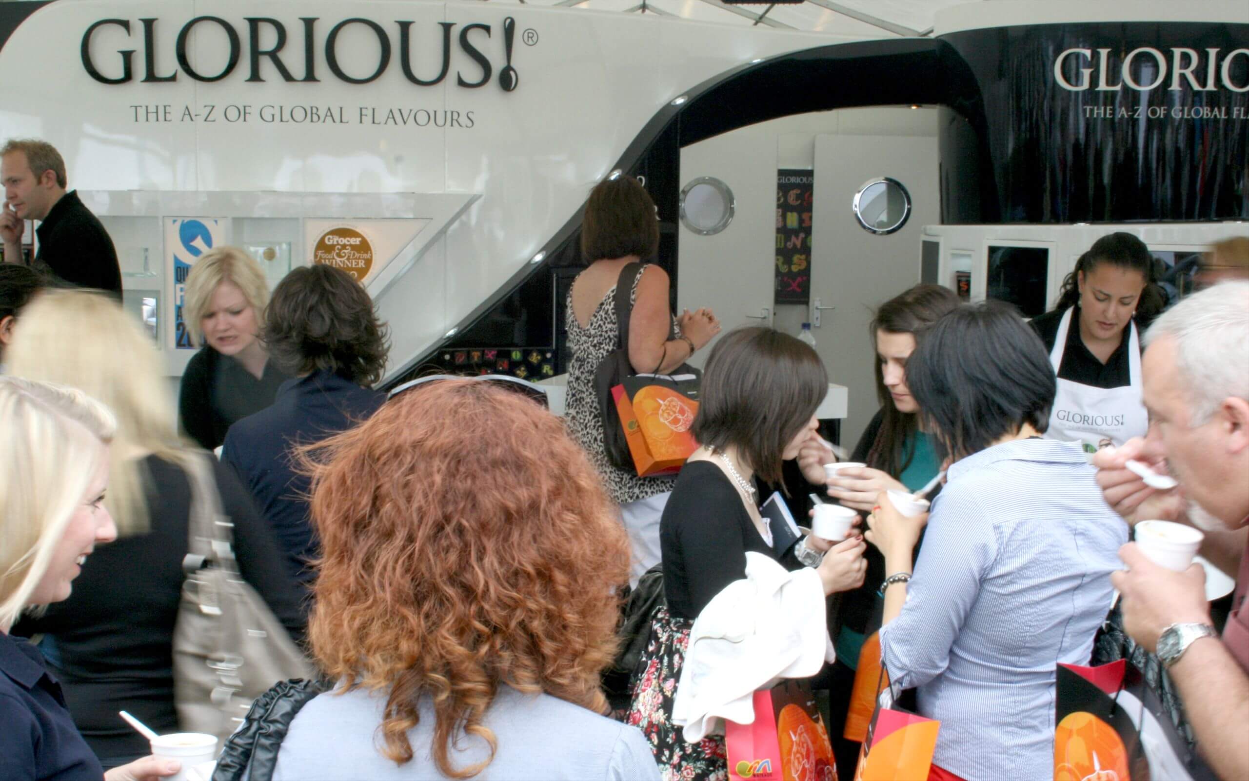
Having been de-listed from major supermarkets due to confused positioning, the owners of Glorious! Soups needed to overhaul it’s fmcg brand identity and packaging, focussing on the experiential rather than the previous worthy positioning, and making the most of its authentic and adventurous mix of global ingredients and flavours.
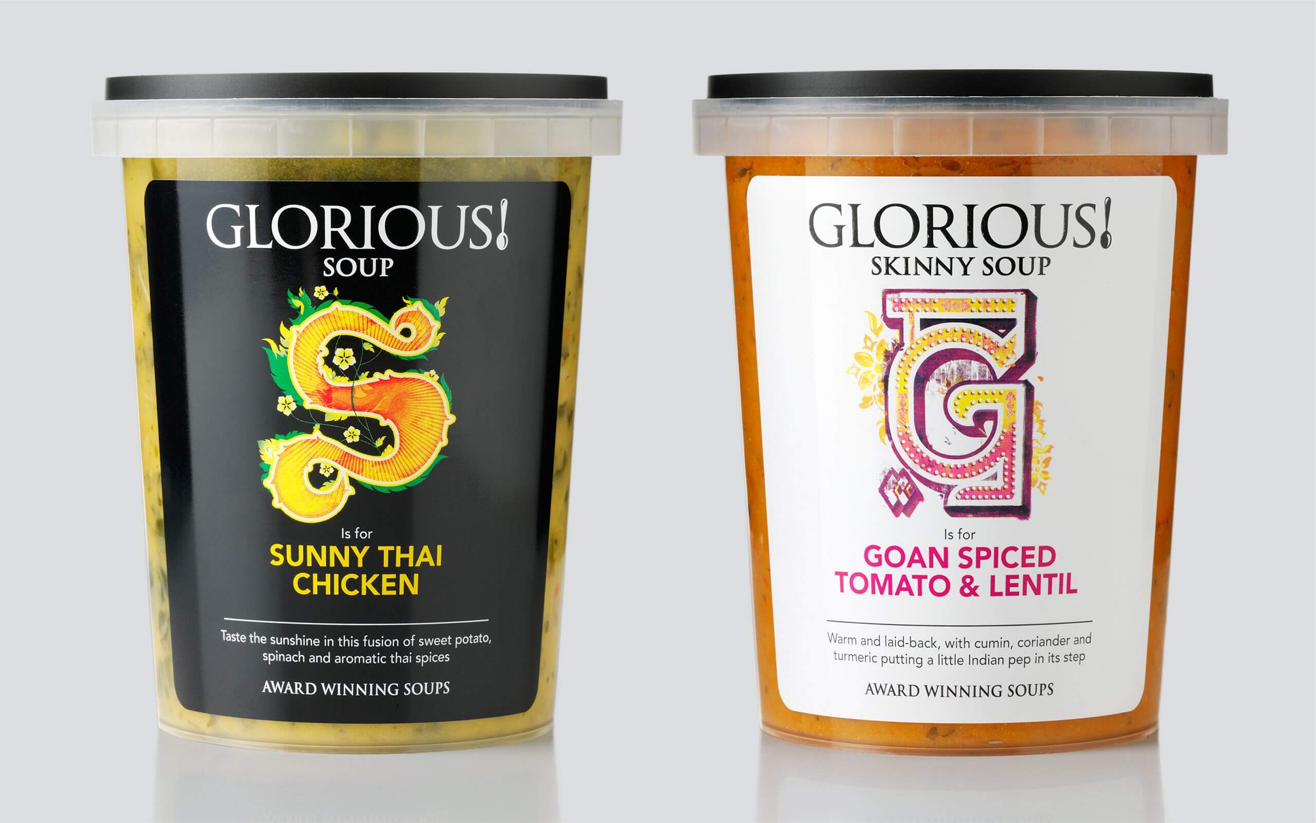
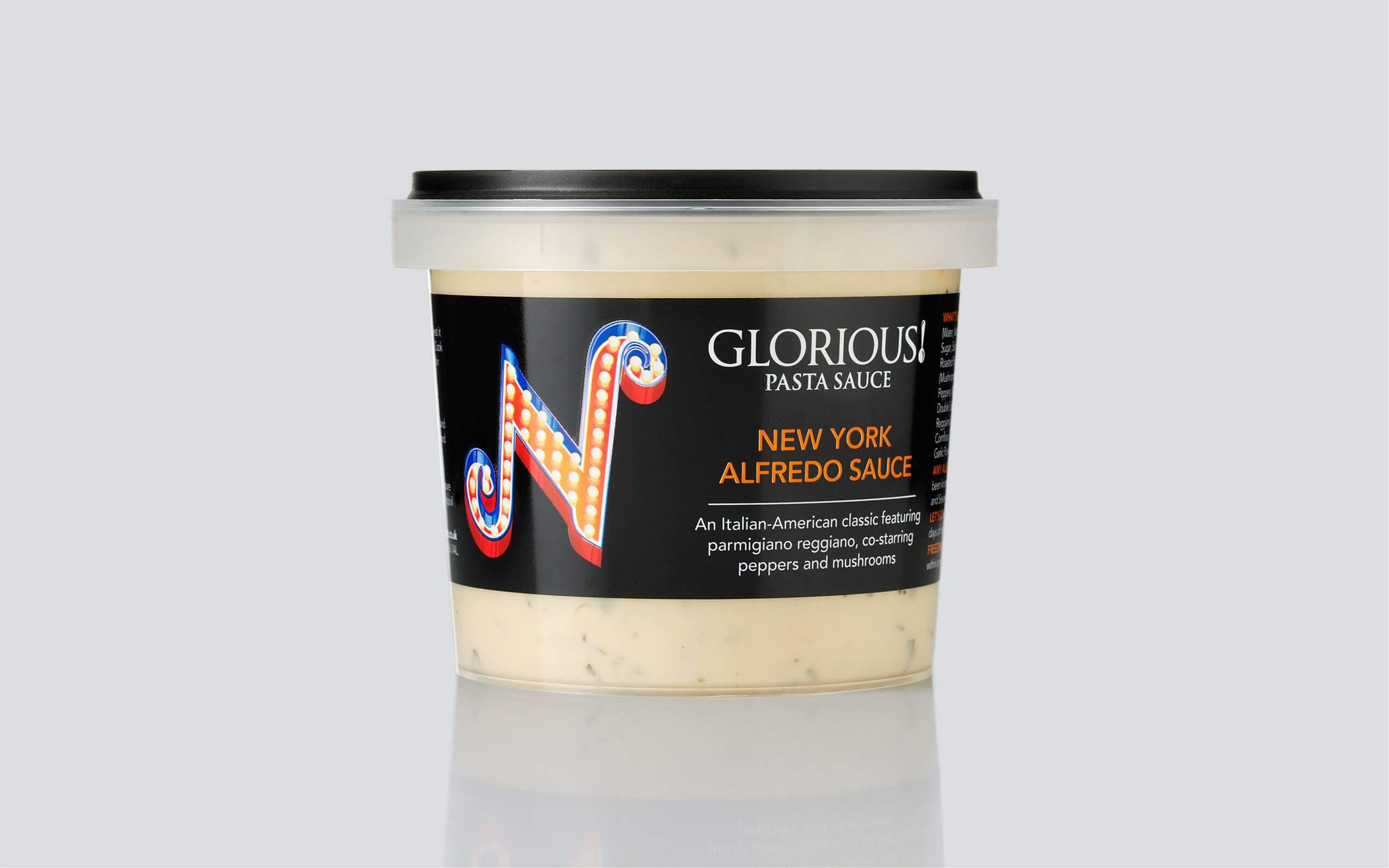
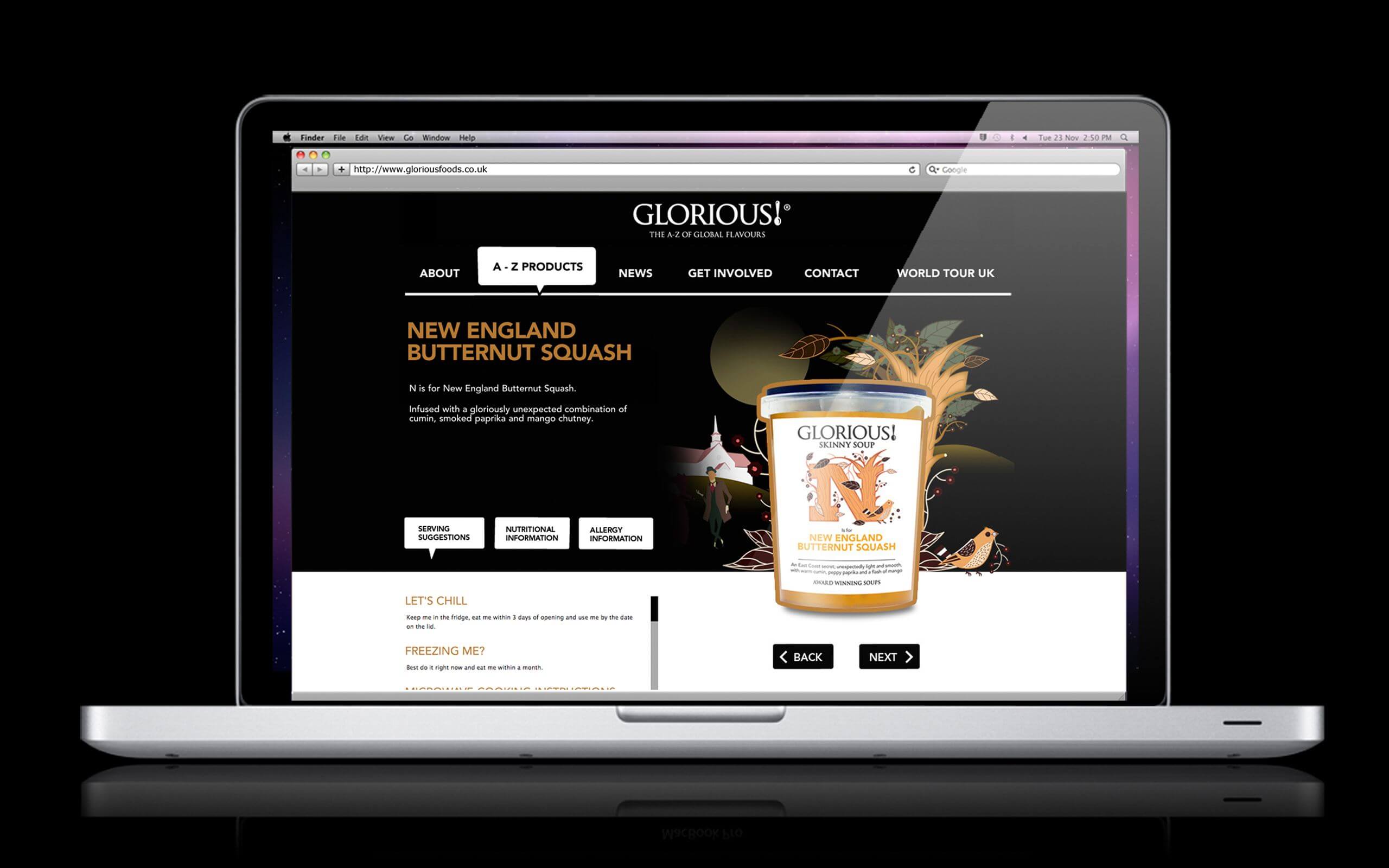
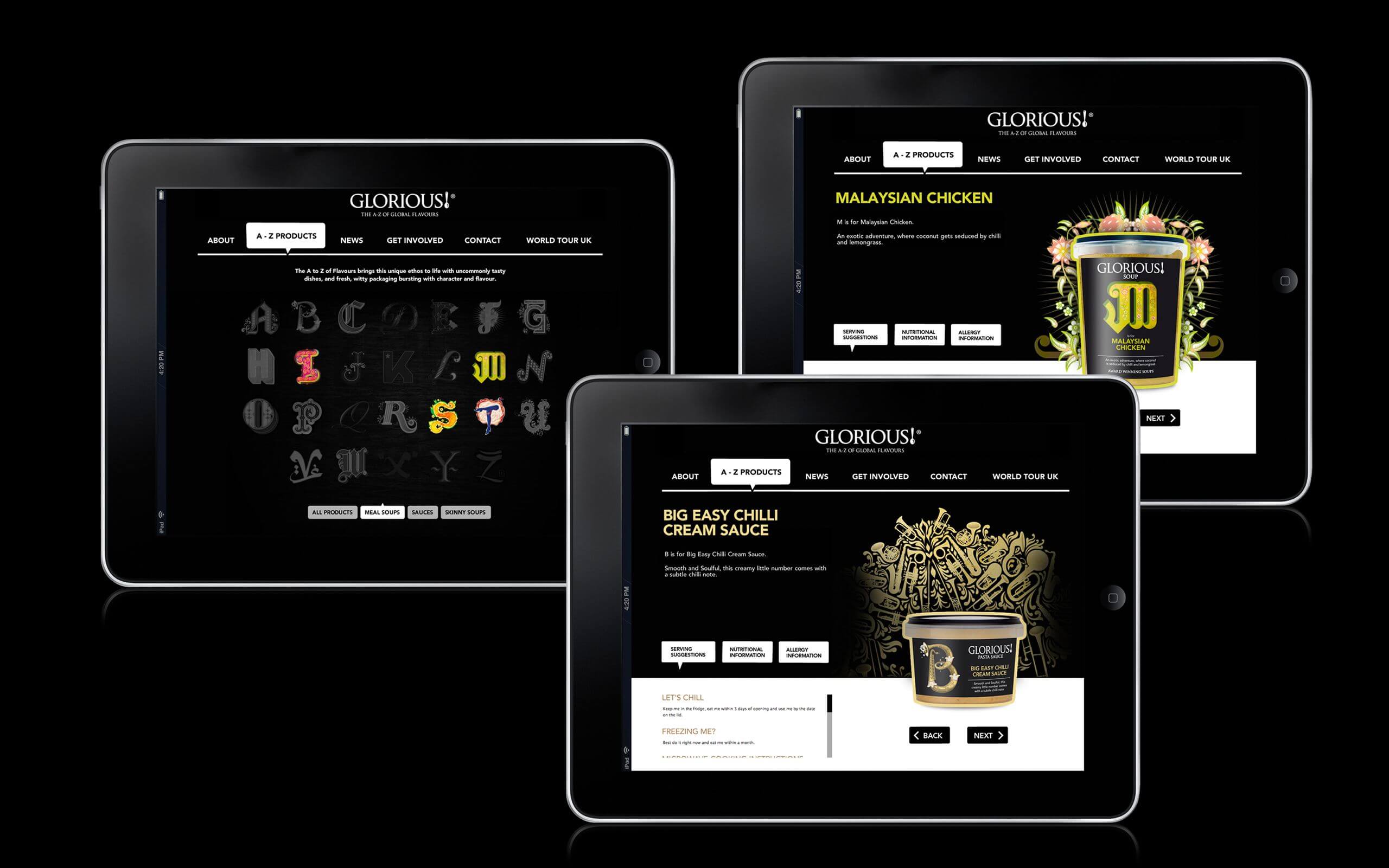
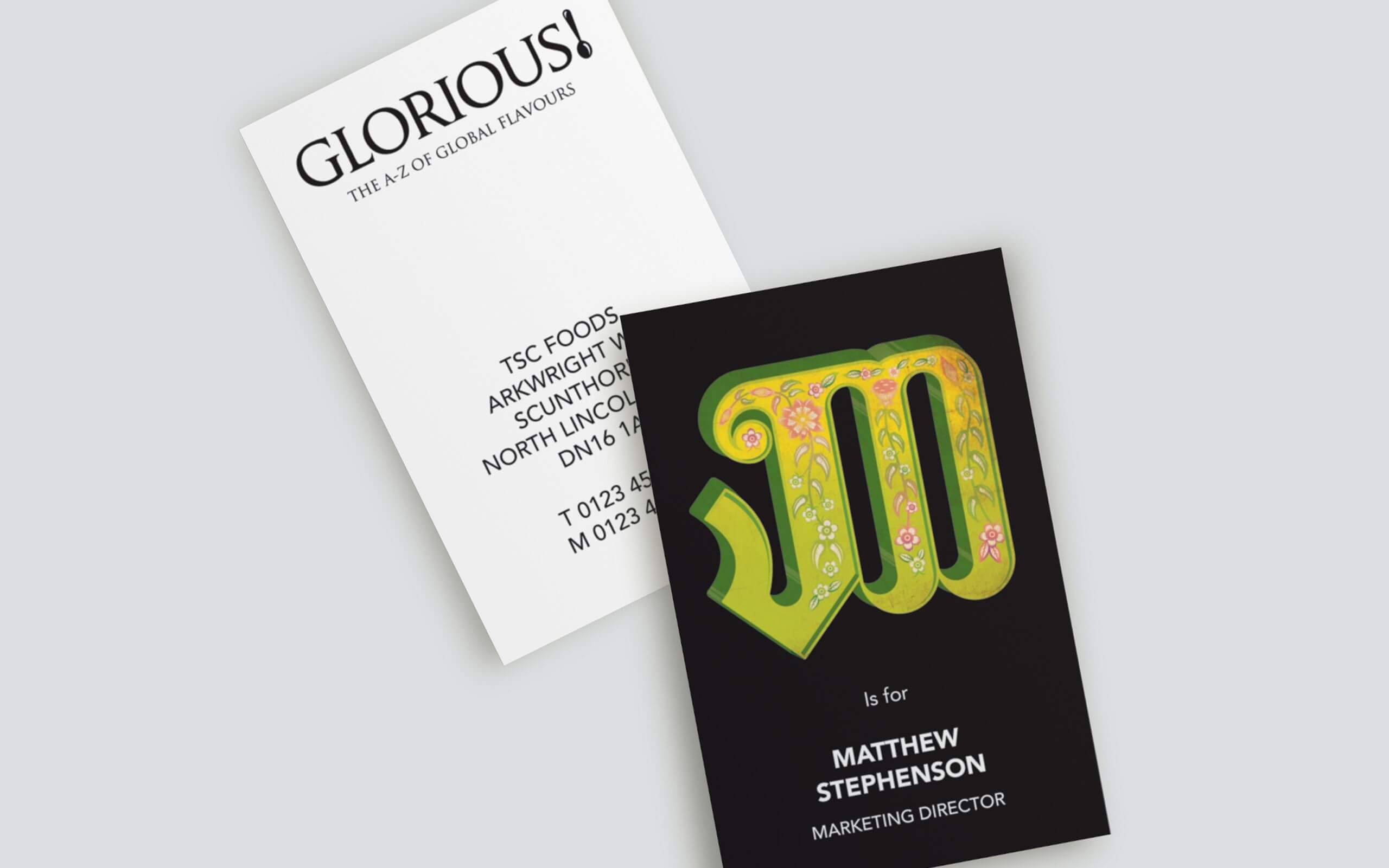
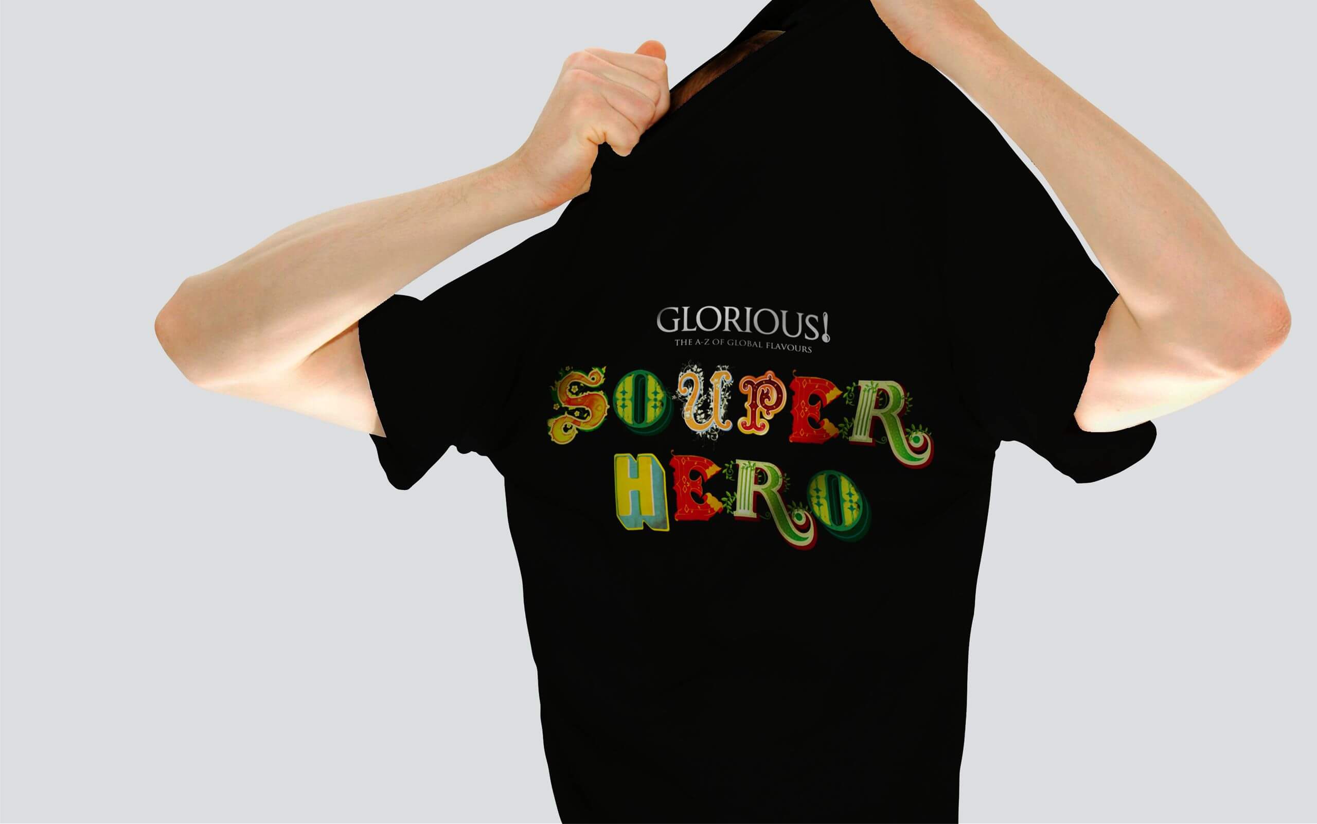
Inspired by the global diversity of recipes, each product was given its own identity based on exotic locations around the world. The designs used bespoke lettering, creating the ‘A-Z of global flavours’, giving the fmcg brand it’s own visual language. We also art-directed their website and mobile tasting van ‘Gloria’.
The result was 139% year-on-year growth, and market share almost doubled.
Read More
Ground Level
Praesta provides professional, bespoke coaching that is both challenging and supportive. They work with leaders, senior professionals and teams in organisations spanning all sectors across Europe.
All of the Praesta coaches have extensive experience of leadership at the highest levels in major companies and organisations, and use the latest techniques to achieve professional growth. But they had fallen into the branding trap of being generically corporate. Suits, stark buildings, stock imagery – all very old-school and ‘establishment’. Not very inspiring. Not very human, open or empathetic. Not very now.
We were approached by Praesta to evolve the brand identity of the global network, to reflect a change in how the coaches and the network operate, and how the business landscape had changed.
Elevated Solution
We were directly inspired by a customer quote: “Working with Praesta brings a fresh perspective, a welcome challenge. They are a true thinking partner and ally”.
Perspective, and seeing all sides at the same time, gives a leader the fuel they need to find new solutions and opportunities.
Our brand idea, The Hinge, was to show how Praesta sees the different sides of a situation at the same time. Inspired by renaissance perspective diagrams our system revolved around a two sided box that shows two opposing facets. The hinge gave a pivot point around which to view, adjust and decide.
We brought the brand to life with perspective typography, a series of hinge shapes that could be animated or static, and a simpler and more human tone of voice. Warmer and more energised colours were introduced to give the brand a new angle. We even hinged the logo on the AE ligature – a hinge at the centre of the brand name.
Perspective for a positive direction.
Click for Contact page