Creating brands that glow, inside and out
Glow London
Industry
Branding, Advertising, Marketing
Glow London
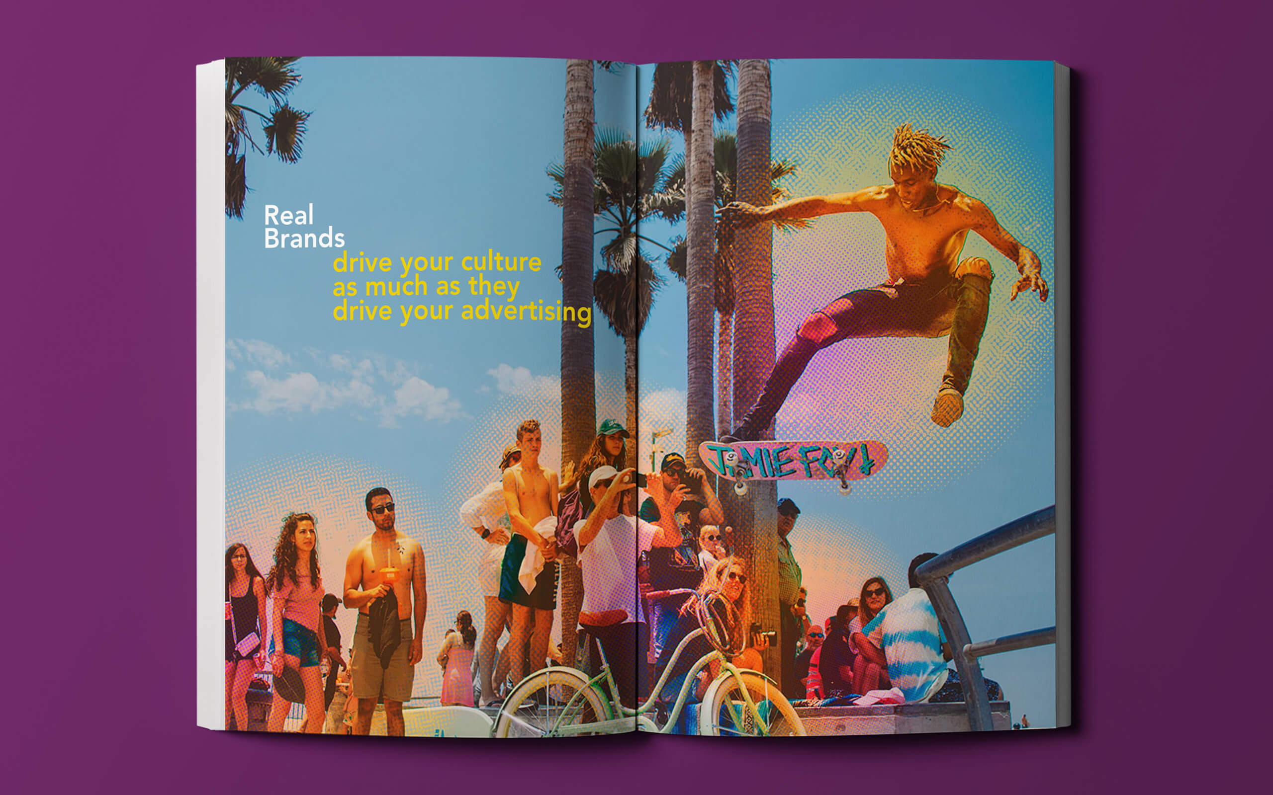
Brand experience agency Glow London find the truths that fuel brands. These truths inform brand identity, and the way the internal teams live and breathe the new brand. Essentially the brand glows and radiates the new beliefs and values from the inside out. The challenge was to create an identity that visualised the ‘glow’ in a non-cliched way across a range of media. It had to bring the agency to life with warmth and humanity.


Read More
Ground Level
Brand experience agency Glow London was founded by brand specialist Emma Harris-Sapani. Emma had previously been Marketing Director for Virgin and Eurostar, and having teamed up with performance specialist Planet K2 she wanted to bring a new offer to market.
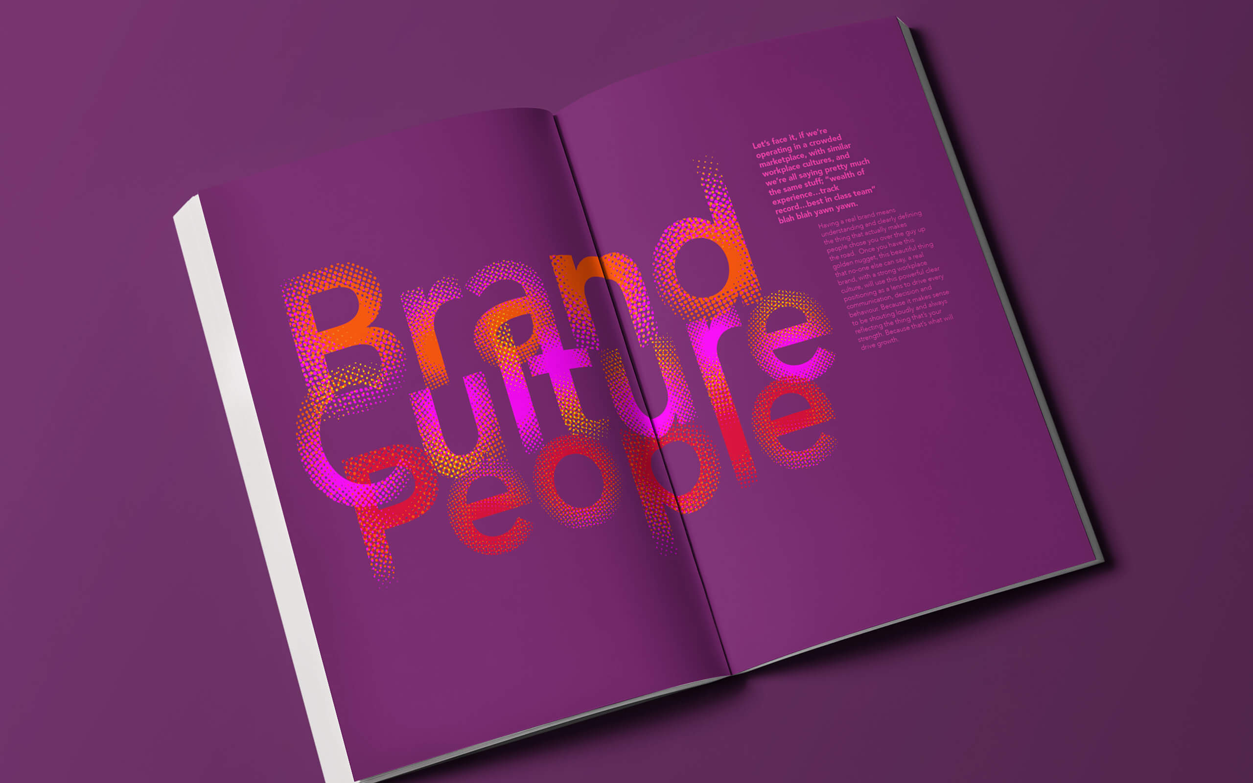
When creating brands most agencies are great at coming up with the strategy and the creative expression, but not necessarily how it links with the internal culture and their people. Glow London looks at the whole picture. They find the truths that fuel the brand, which informs the brand identity, and the way the internal teams live and breathe the new brand. Essentially the brand glows and radiates the new beliefs and values from the inside out. This means that the brand is joined up by a single thread and has more likelihood of delivering a consistent message and brand experience to their customers, for a longer period of time. People drive the performance.
Elevated Solution
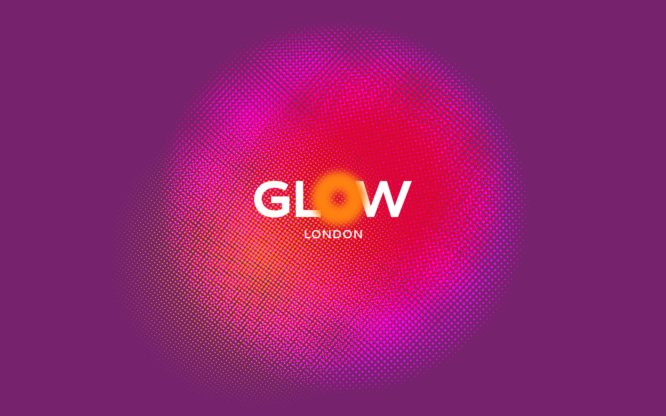
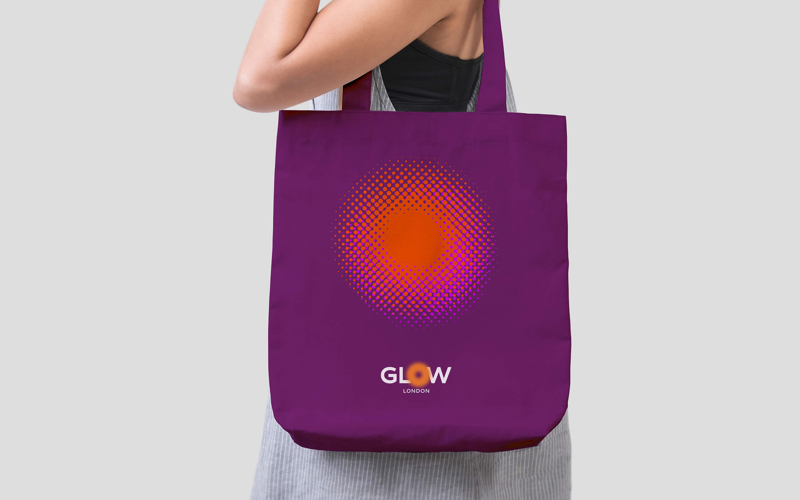
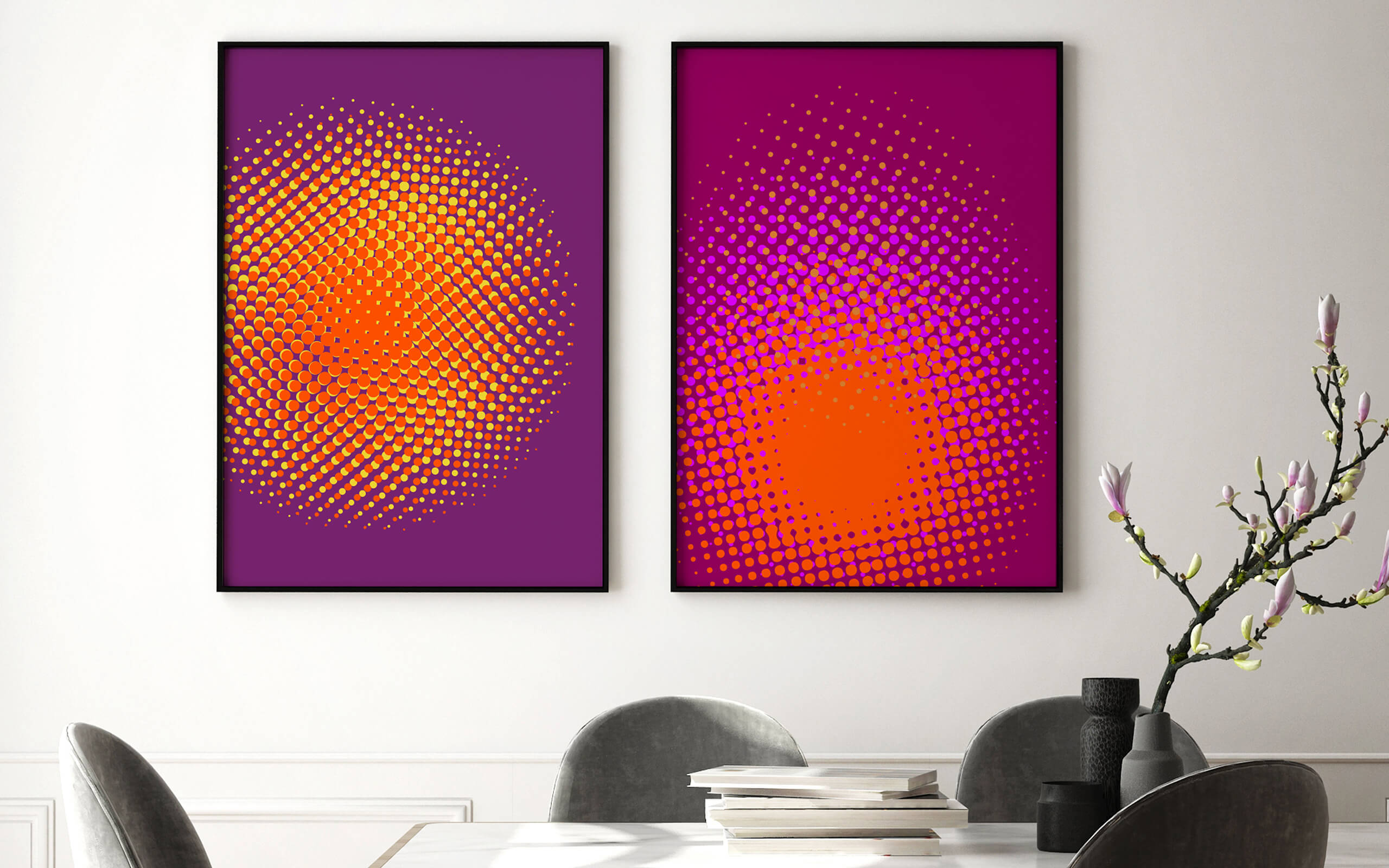
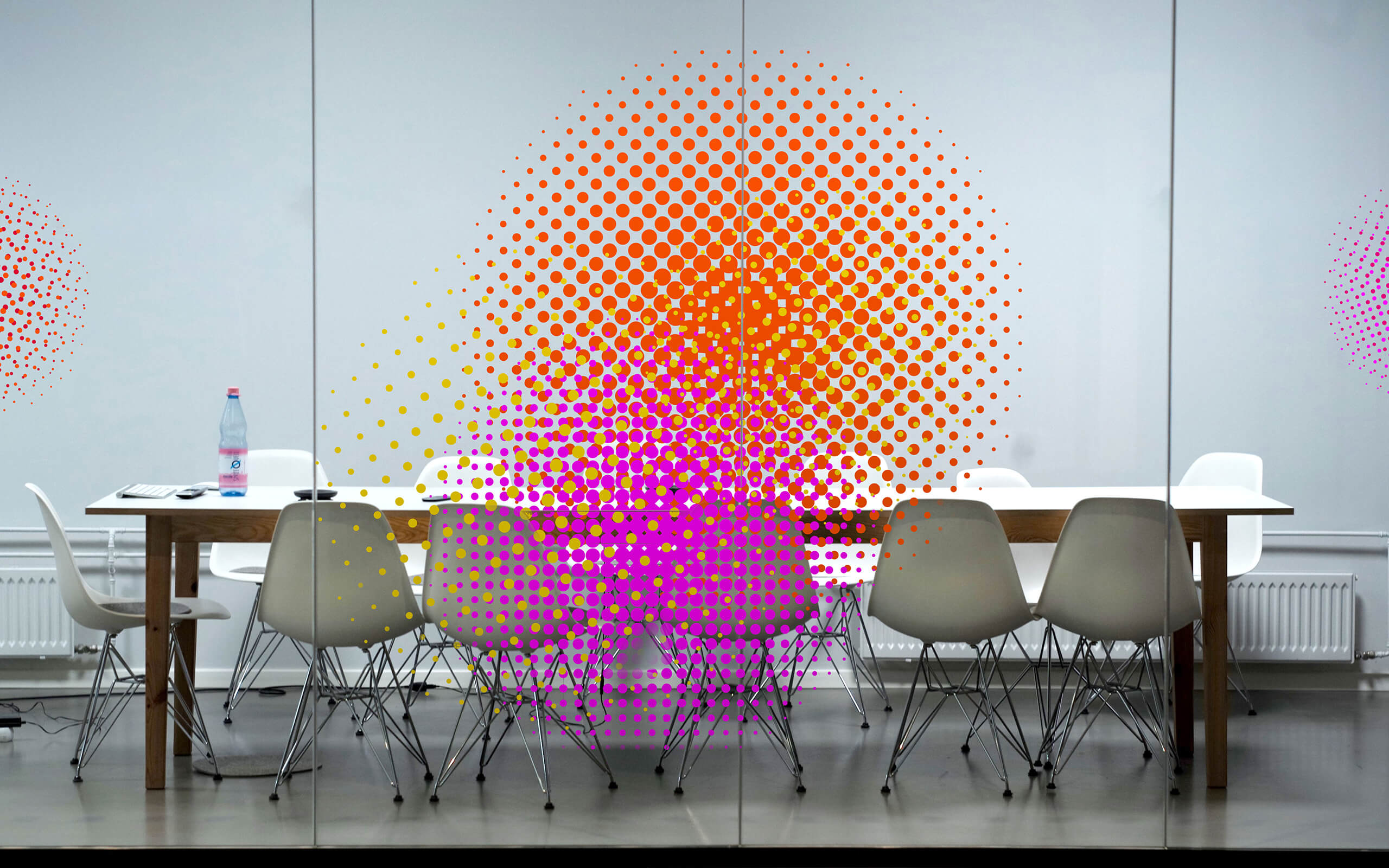
The challenge was to create an identity that visualised the ‘glow’ in a non-cliched way across a range of media. It had to bring the agency to life with warmth and humanity. As glows can have different states, from spark to radiating to shining we created a series of visual properties that could express different stages of a brand’s journey. They all used warm colour tones but had different energy states from dynamic to more controlled. Each glow could work as a graphic or as a highlighting device showing where the glow was originating from – mostly from inside people.
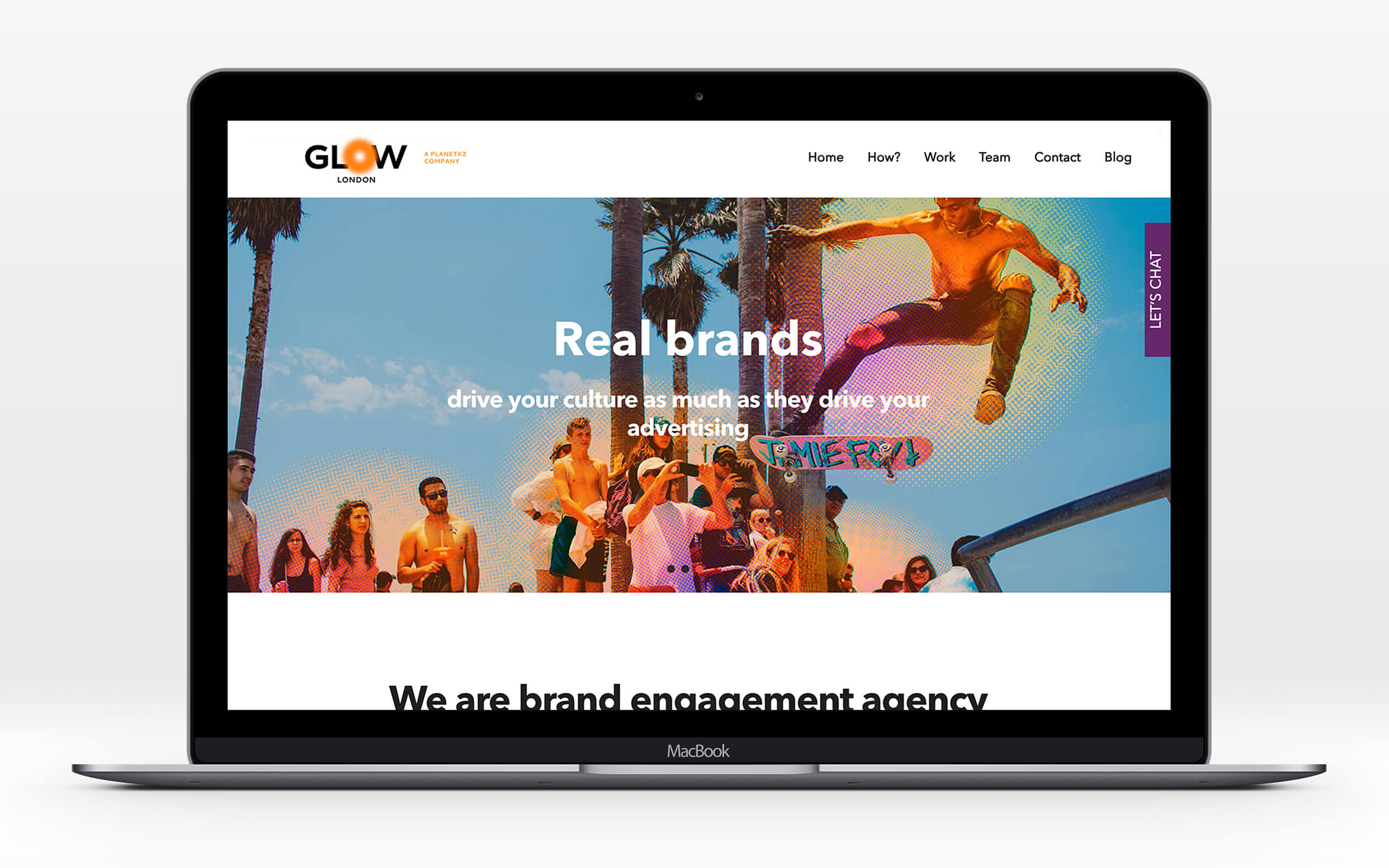
The principal feeling we wanted to convey was the energy that not only Emma but the whole team brought to any challenge. Animating the glow graphics showed how the process was full of shape changing and excitement in the evolving process. We applied this new palette of assets across digital and printed items. From the website outlining the process, and digital billboards broadcasting the top line messaging, to bespoke mailers highlighting specific issues that brands we’re facing. The new identity gives their customers a more coherent brand experience.
Click for Contact page