Adventure in motion

Brand StrategyFeaturedMotion GraphicsVisual IdentityWebsite BuildWebsite Design

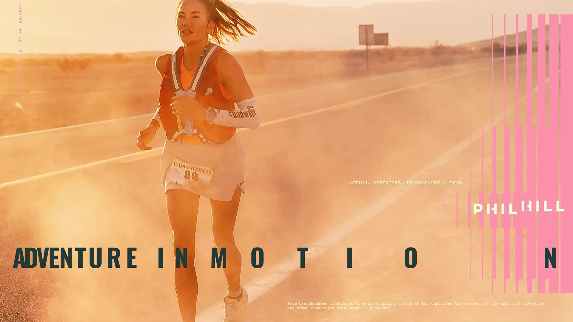
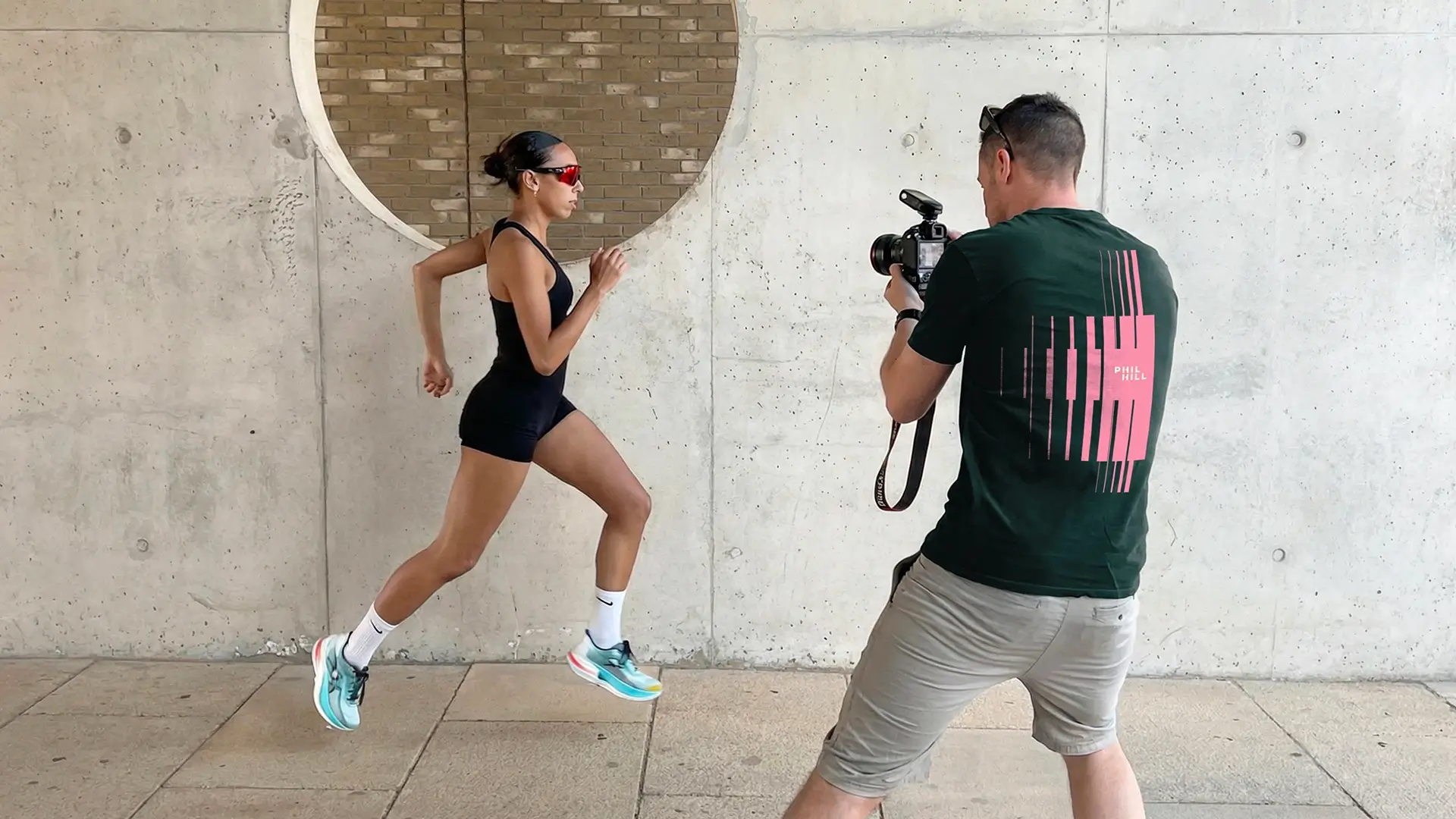
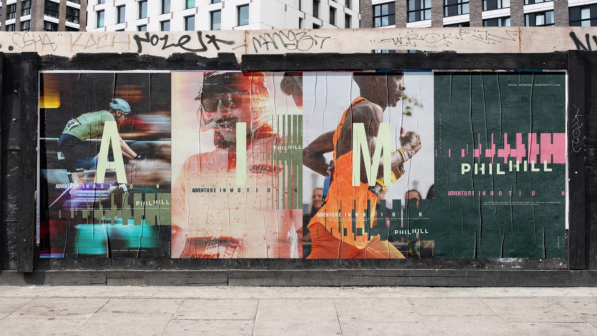
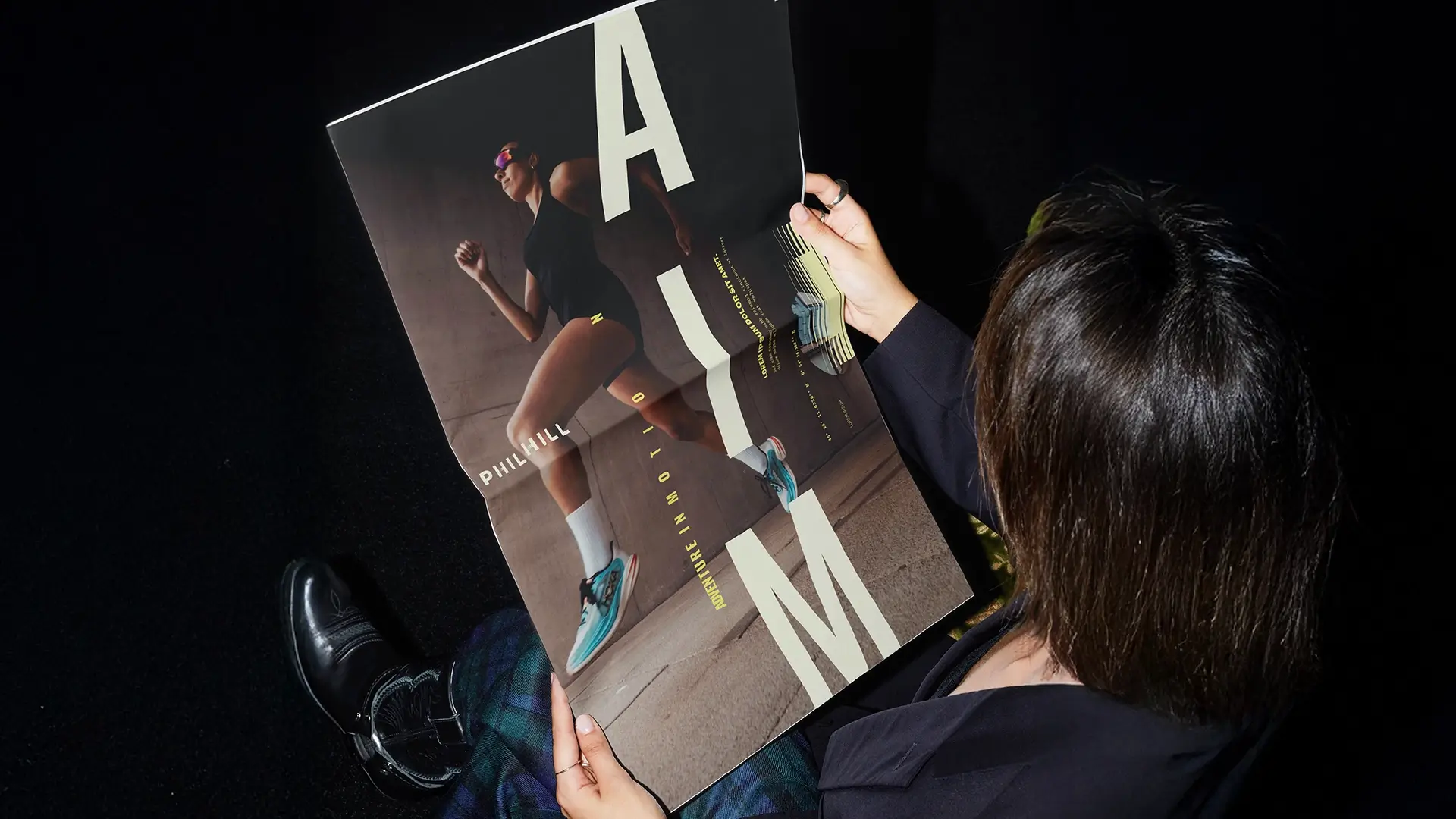
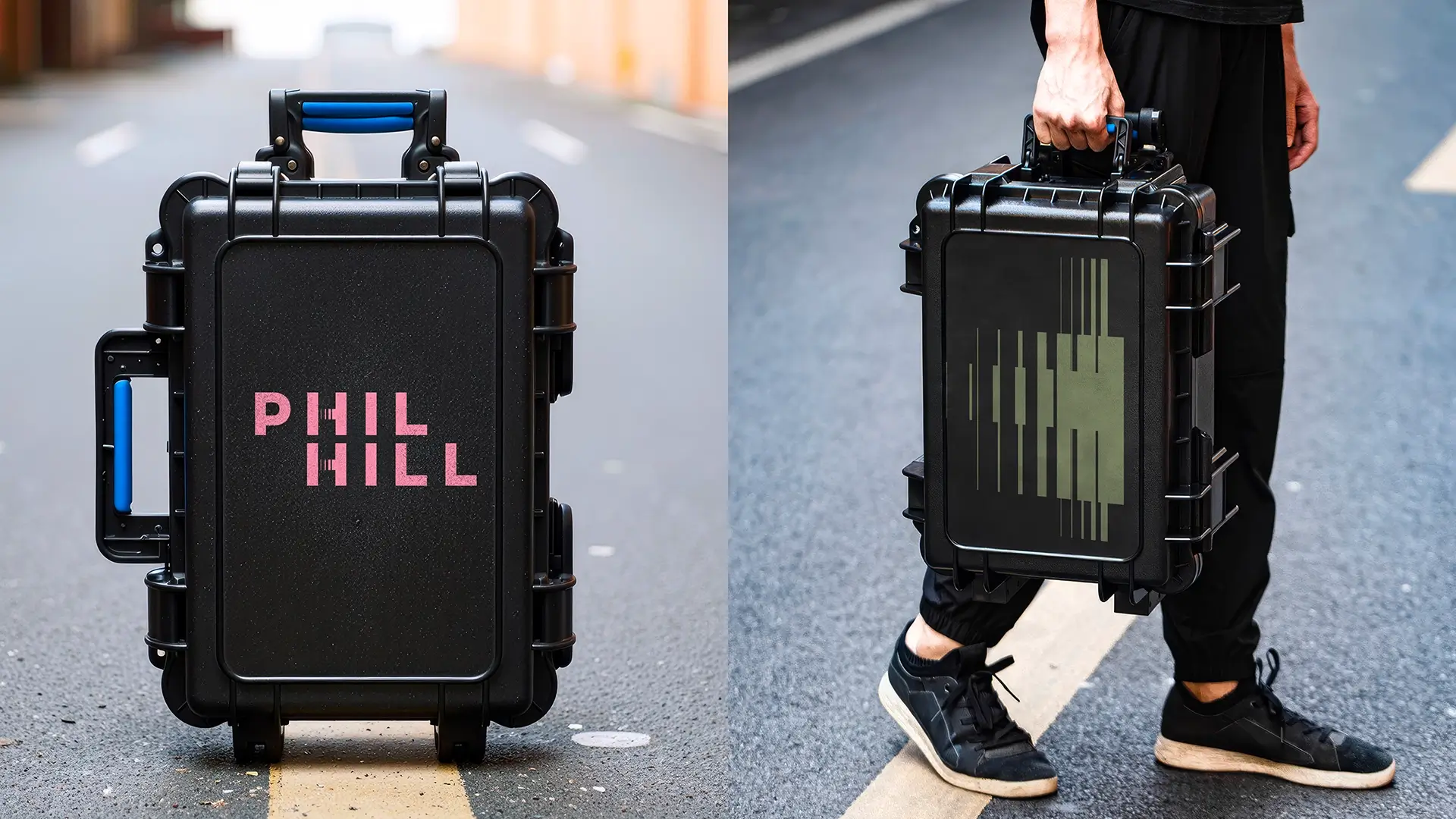
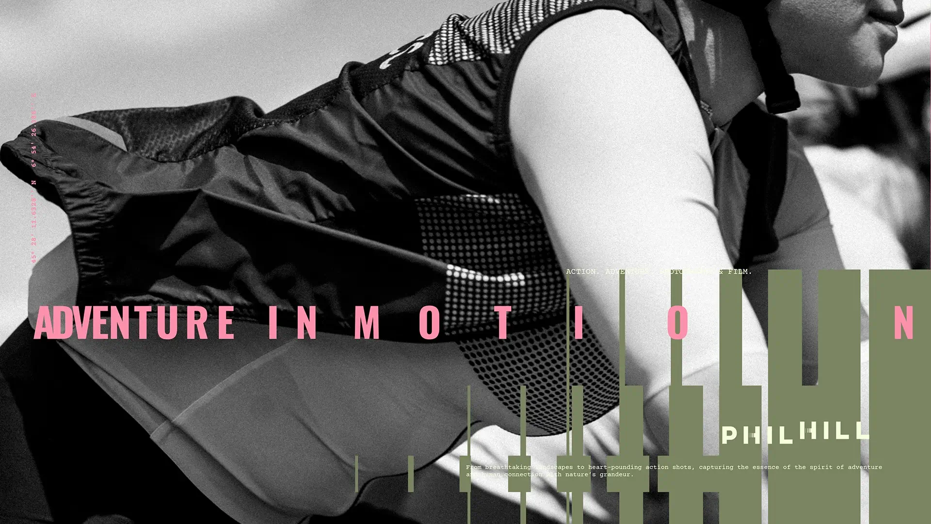
Phil Hill is a trusted adventure sports photographer and videographer who captures the personal stories and individual challenges of athletes and everyday people reaching for their goals, personal satisfaction, and their own adventures. How they get there, the challenges (physical and mental) that they face, the environments they perform in all feed into the retelling of these adventure stories in motion.

The task was to rebrand Phil as an artist rather than a company, and to help him standout as the leading photographer and director for brands in the running, adventure and adventure sports sectors looking to capture their next campaign or tell their athletes’ stories.

Process: The before, and the elevation

Phil Hill had been operating under the name ‘PH Balance’ as a company/studio. The aim was to become more well know as an artist in his own right, to become more recognised and sought after for photography, videography and documentary projects. The new brand was to help promote his ‘adventure’ documenting approach and to be commissioned by a wider group of top tier brands and influential startup brands, and widen his commercial appeal.

Phil captures sporting endeavours that are personal, sometimes un-organised, in the wild natural or wild urban envrionments, and largely without audiences and crowds. Beyond his professional work, he’s an avid trail runner, cyclist, and swimmer. This connection and deep understanding of sports empower Phil to craft authentic, compelling photography that embodies the very essence of adventure.

The task was to create a new brand identity that clearly explains who Phil Hill is and what he does and stands for. This was to create a clearer and stronger message, and toolkit of dynamically consistent assets that would help to attract a wider base of clients, and to be seen as one of the top photographers and directors in his niche: the first choice to capture an athletes story.

Building on Phil’s ability to capture adventure in motion, the brand concept is built around documenting those specific moments of adventure in time. The vertical lines represent the journey and the moments of adventure in time where the stories happen, captured at varying levels of intensity. The arrangement of the lines create loose ‘H’ shapes, echoing the brand icon. The constructed patterns vary in shape, height and width, to respond to the different types of activity.

The brand system is then built out by connecting these patterns to the athlete and the person in the flow of their journey of discovery. Personal Stories. Human Desire. Individual Challenges and Suffering. Rewarding Moments. Natural greens evoke the wild environments, with a passionate pink and energised yellow adding to the brand colour palette.

The main focus is Phil’s photography and film making, with the patterns performing a supporting role. Adventure is about the steps on the journey not the destination.

Adventure in motion can also be shortened to ‘AIM’, capturing both the photographic technicalities as well as the athlete’s goals.

The brand was applied initially to a newly designed and built website and promotional items.

I worked with Andrew and Taller Design for my rebrand and new website and couldn't be happier with the results. He was fantastic to work with, super creative and would highly recommend using him as a designer to anyone looking.

Phil Hill
Click for Contact page

Ready to start a project? Get in touch.