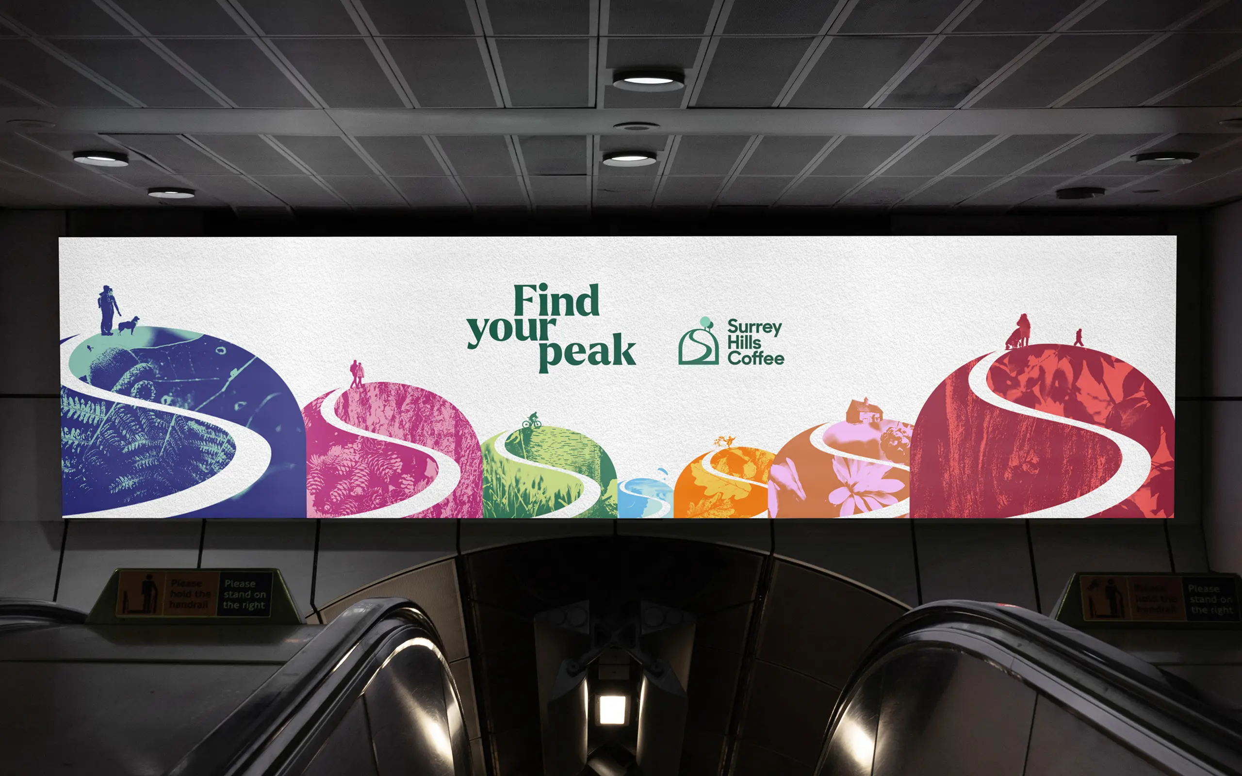
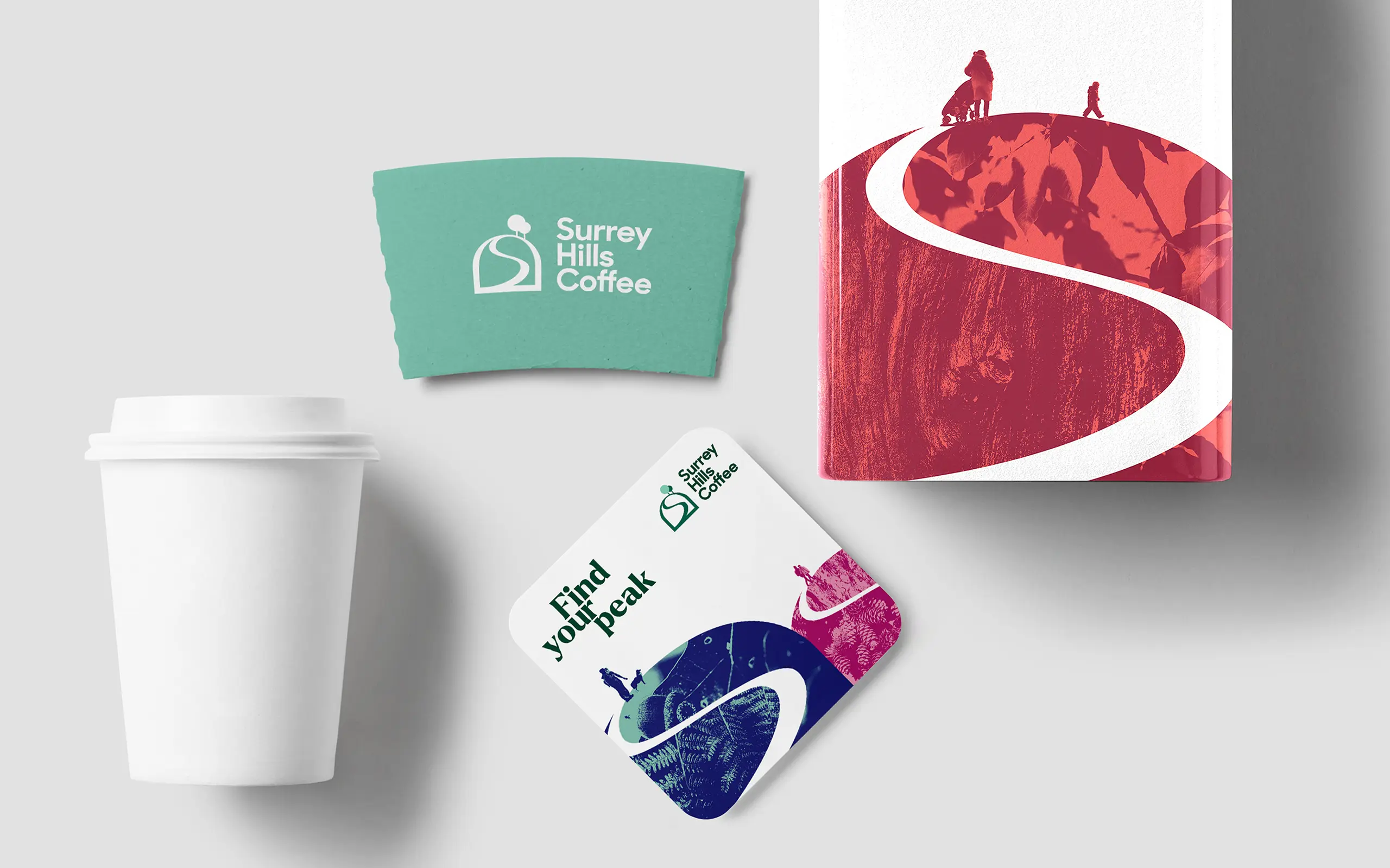
Find your peak
Surrey Hills Coffee
Industry
Coffee Roasting and Distribution
Surrey Hills Coffee
Taking inspiration from the local hills and environment and making the brand rooted to its location in the heart of the rolling hills, we interpreted the journey to finding your peak and the right blend for you.


Read More
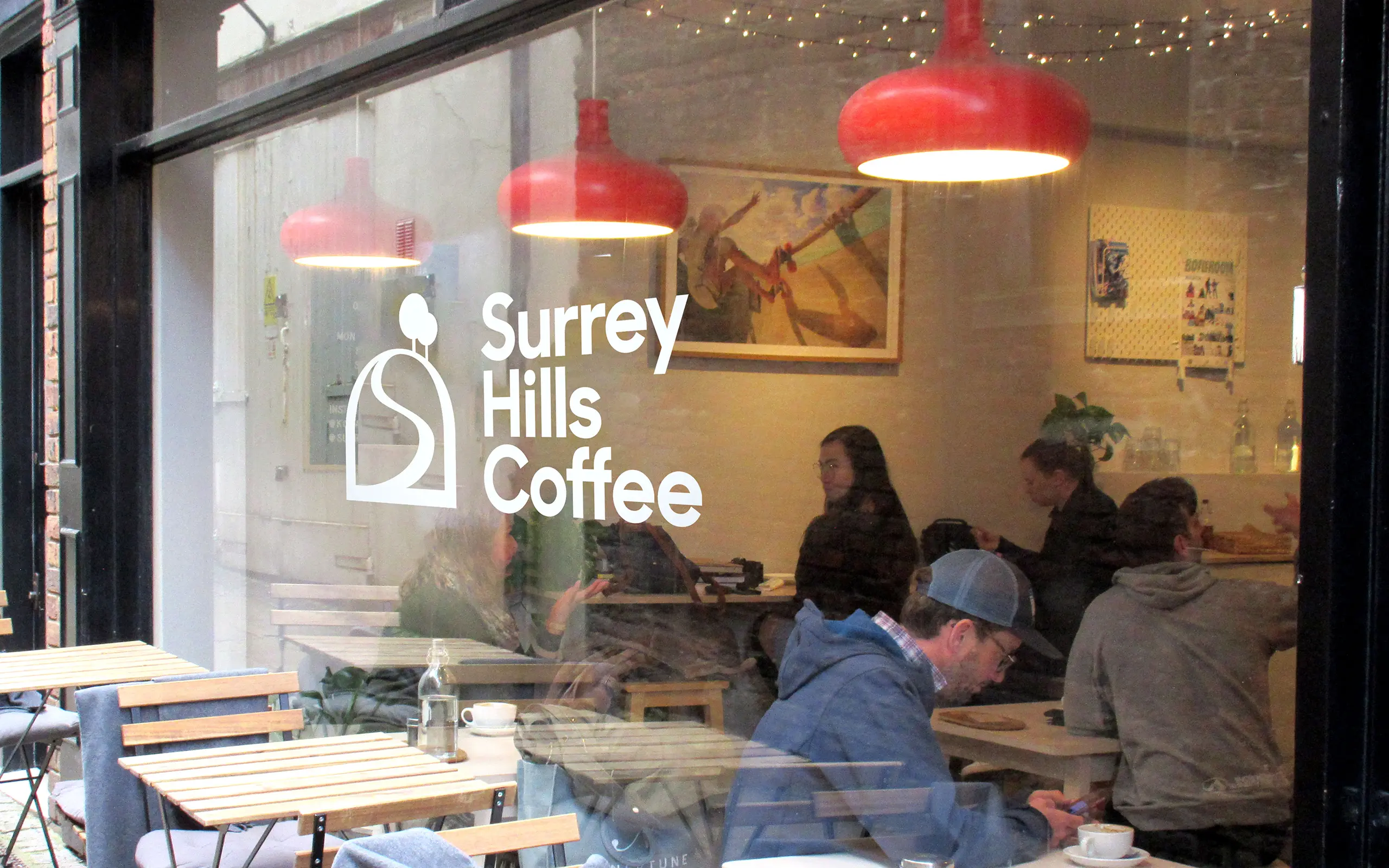
Ground Level
Surrey Hills Coffee provide a well balanced range of ethical specialist coffee blends to stimulate the local community socially, emotionally and financially. Surrey Hills Coffee’s founders, Monika and Chris, have worked in coffee for nearly 20 years and, as part of a work-life balance, they have been successfully running the company for the last few years in Guildford and Abinger Hammer, in the heart of the Surrey Hills. The company is based in an out-building in the rural garden of the couples house. The charm of the operation is the fact that the whole process and the roastery ‘factory’ has been created from scratch, and by hand, with love. The challenge was to capture this authenticity, to have a slightly artisan feel, but to make the operation feel more efficient and ‘grown-up’ without losing the feel, and to definitely not look like a corporate pretending to be independent.
The founders have an eye on the future, and wanted to evolve Surrey Hills Coffee into something that is seen as more professional, that can drive more custom, and to shift from the focus from being just on Chris and Monika as the faces of the brand.
Elevated Solution
The aim was to make the company and the brand seem ‘cleaner’ and more professional, and to make it seem like the company had evolved and not radically changed. The key drivers that the creative was based on was:
Local – linked to the proximity to their audience and freshness, as well as the community that is involved and active.
Stimulating – making something happen, thought provoking mix of old and new, interesting, physical reaction to the coffee, artistic reaction to experiencing and viewing beauty (especially the nature in the Surrey Hills)
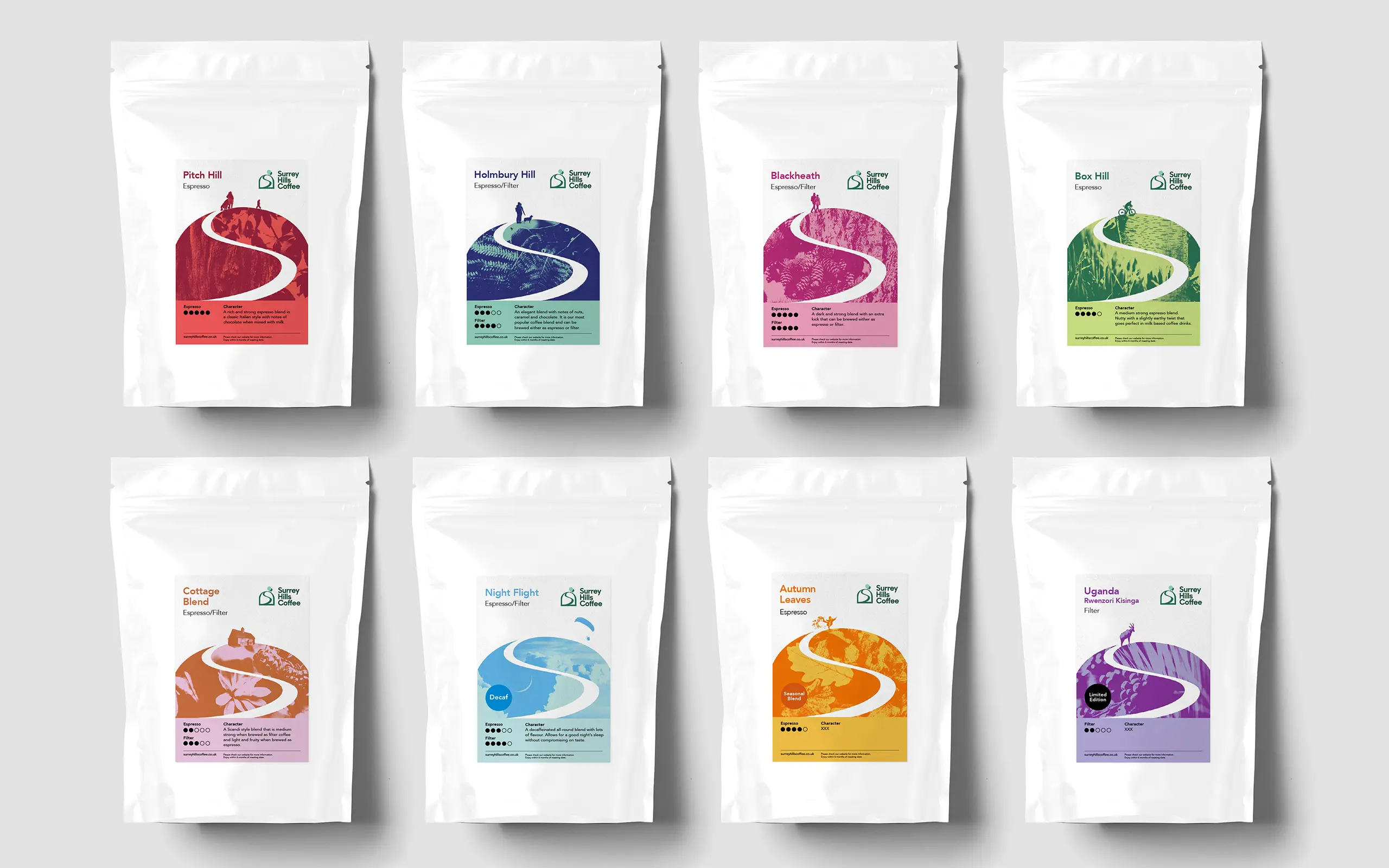
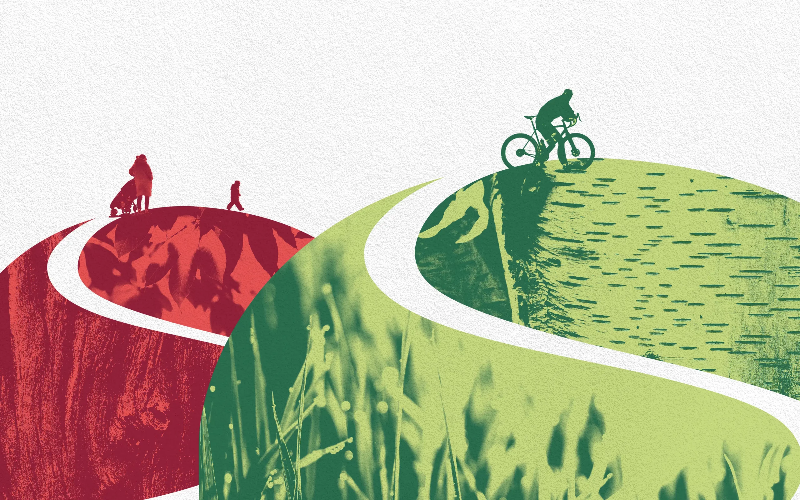
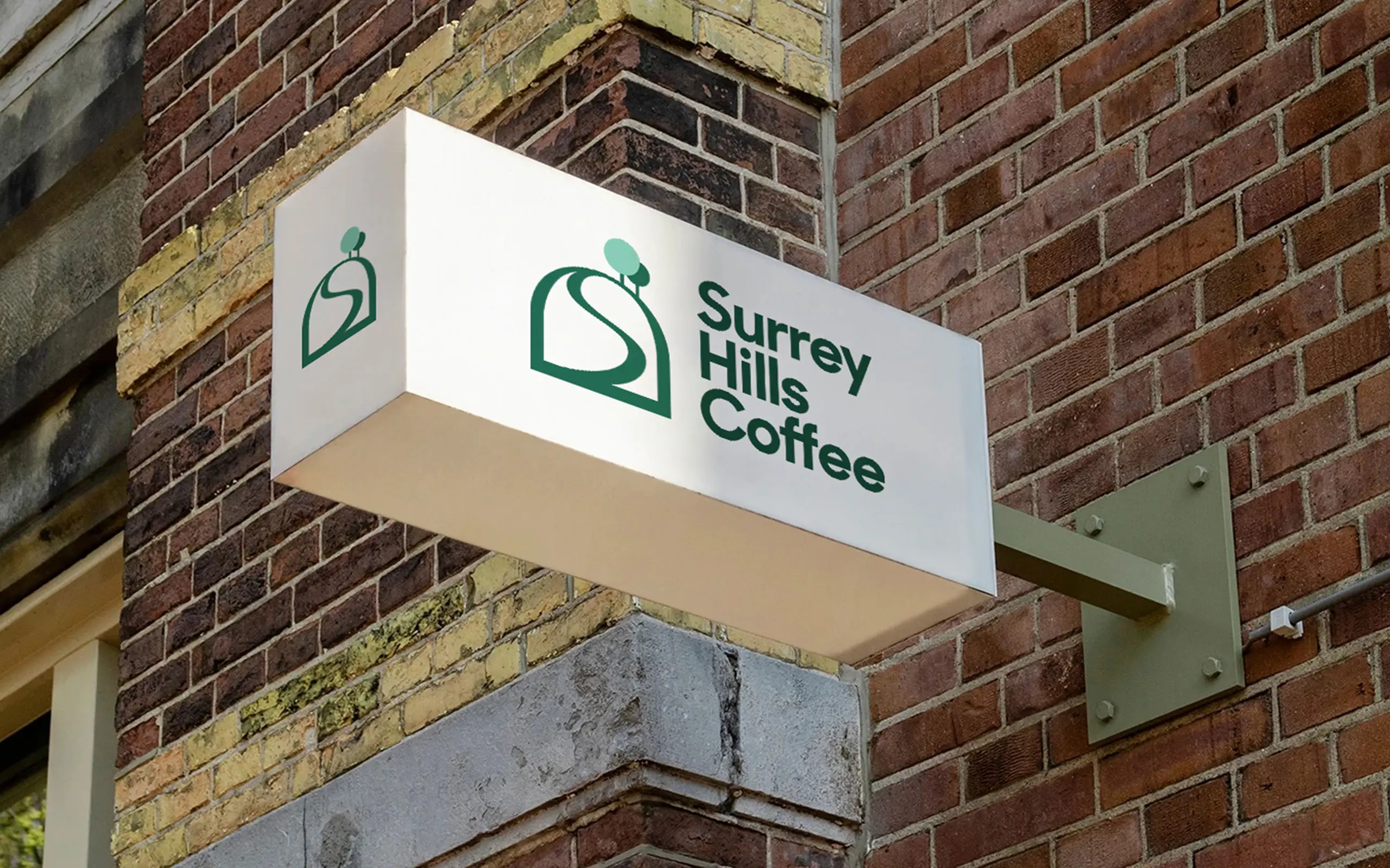
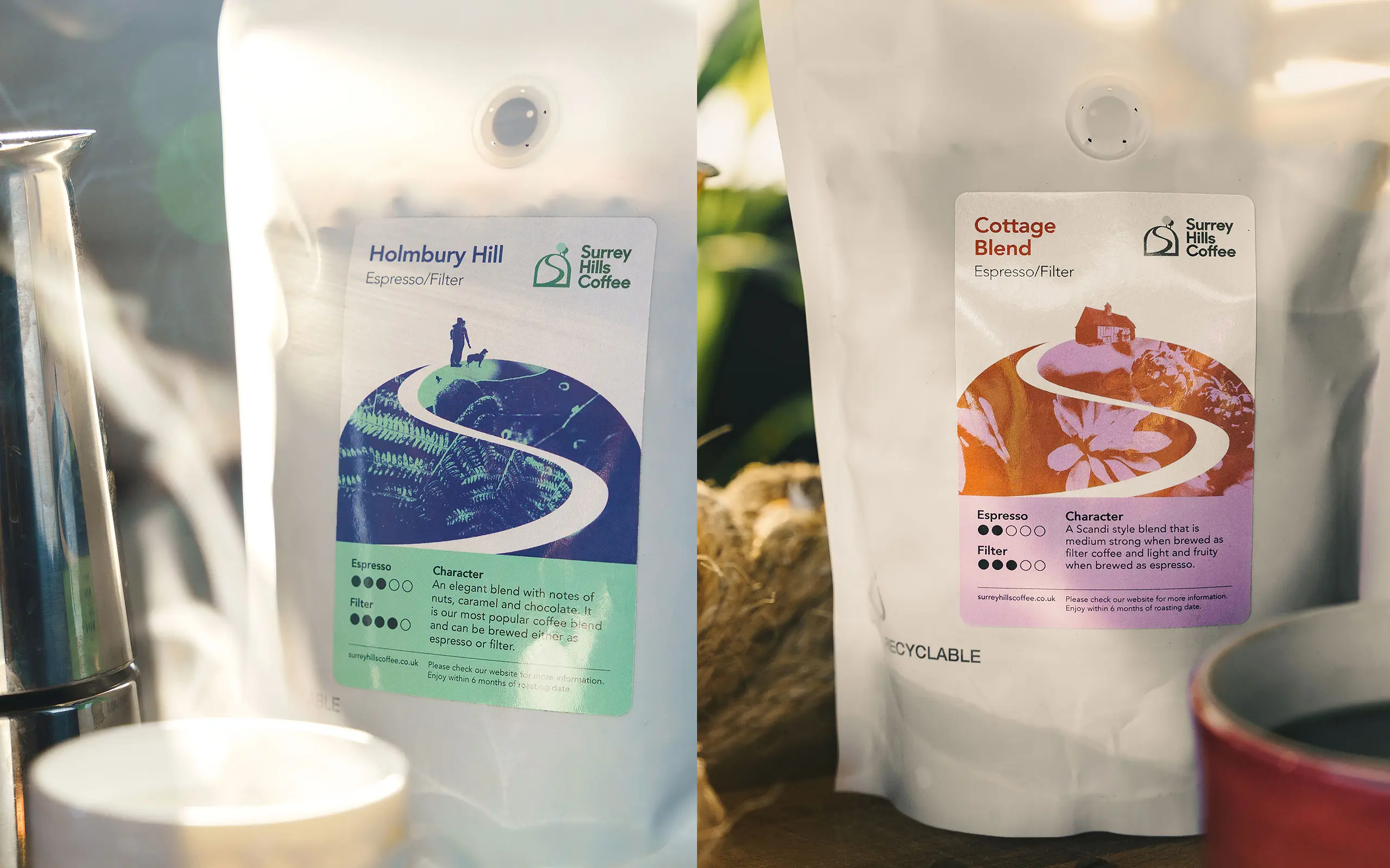
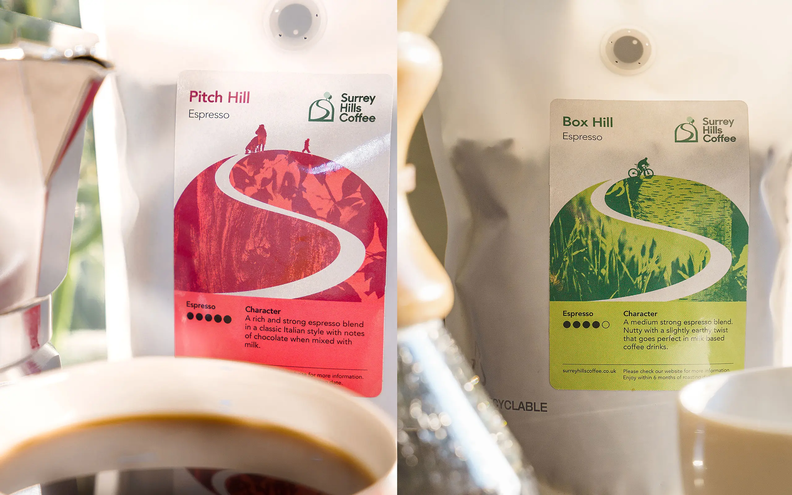
We developed the creative by giving each blend, and ‘hill’, it’s own character by using people, colour and nature as a pattern. The icon echoed the Surrey Hills, and there was a nod to the S which formed a path to the top of the hill but also referenced steam rising.
Each ‘hill’ also had a height that referenced the strength of the blend- the higher the stronger.
There were also some clear guardrails to not fall into the cliches of coffee beans as motifs, brown, or to be overtly trendy.
Click for Contact page