Moving knowledge and learning forward
Oxford University Press
Industry
Publishing
Oxford University Press
Oxford University Press moves knowledge and learning forward through products, services, and latest thinking in education and research. We worked in collaboration with Claire Berthet and Company to develop their new identity across two service sectors and a major report.
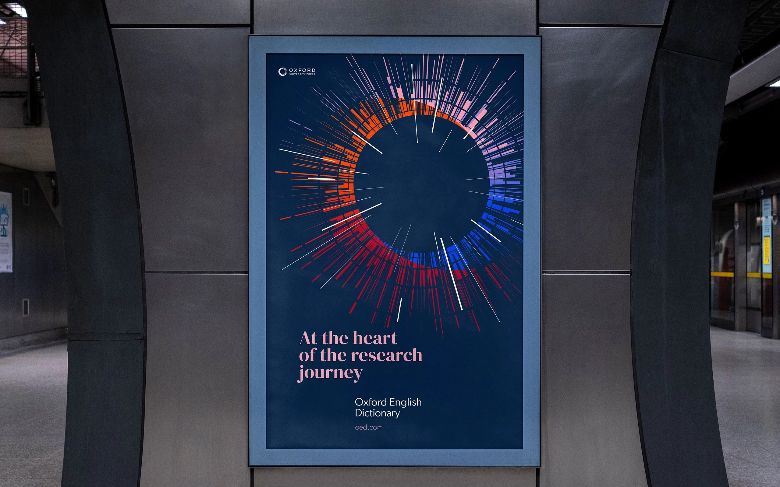
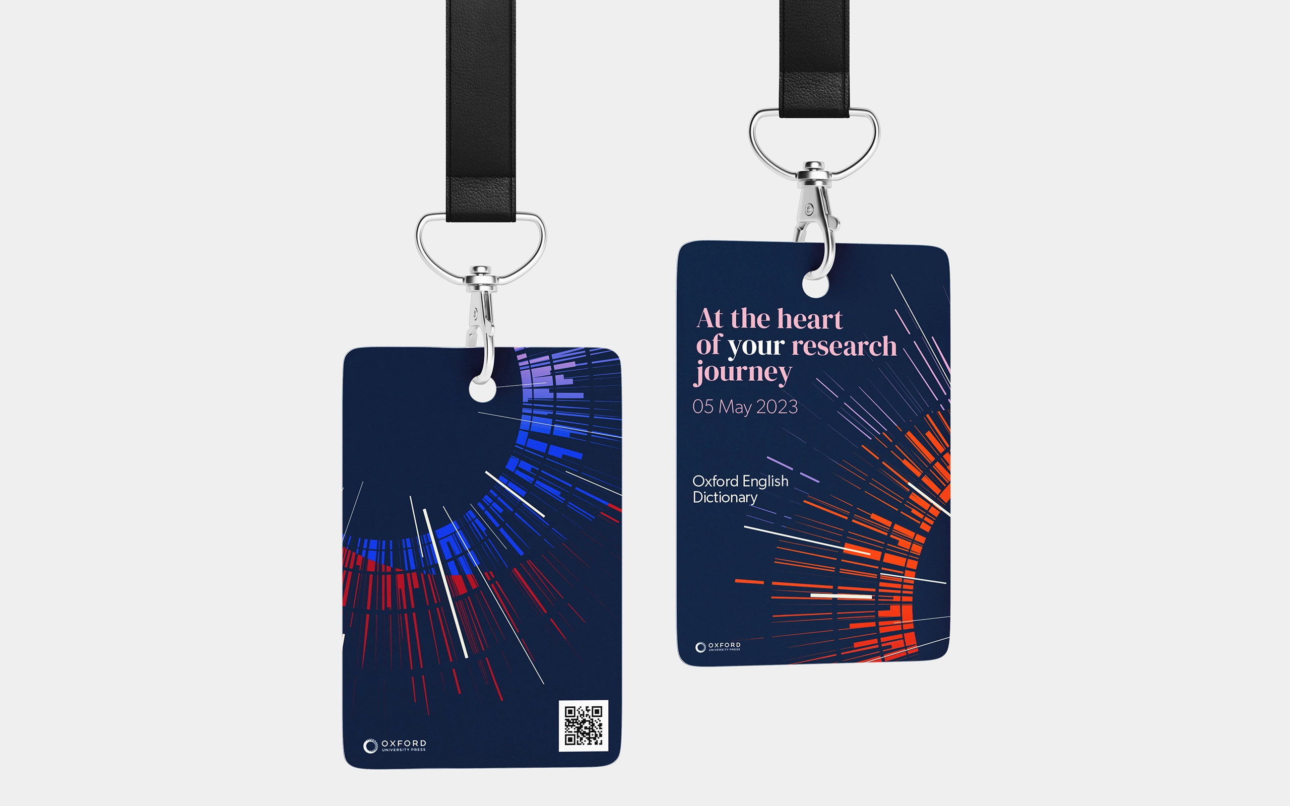
Oxford English Dictionary
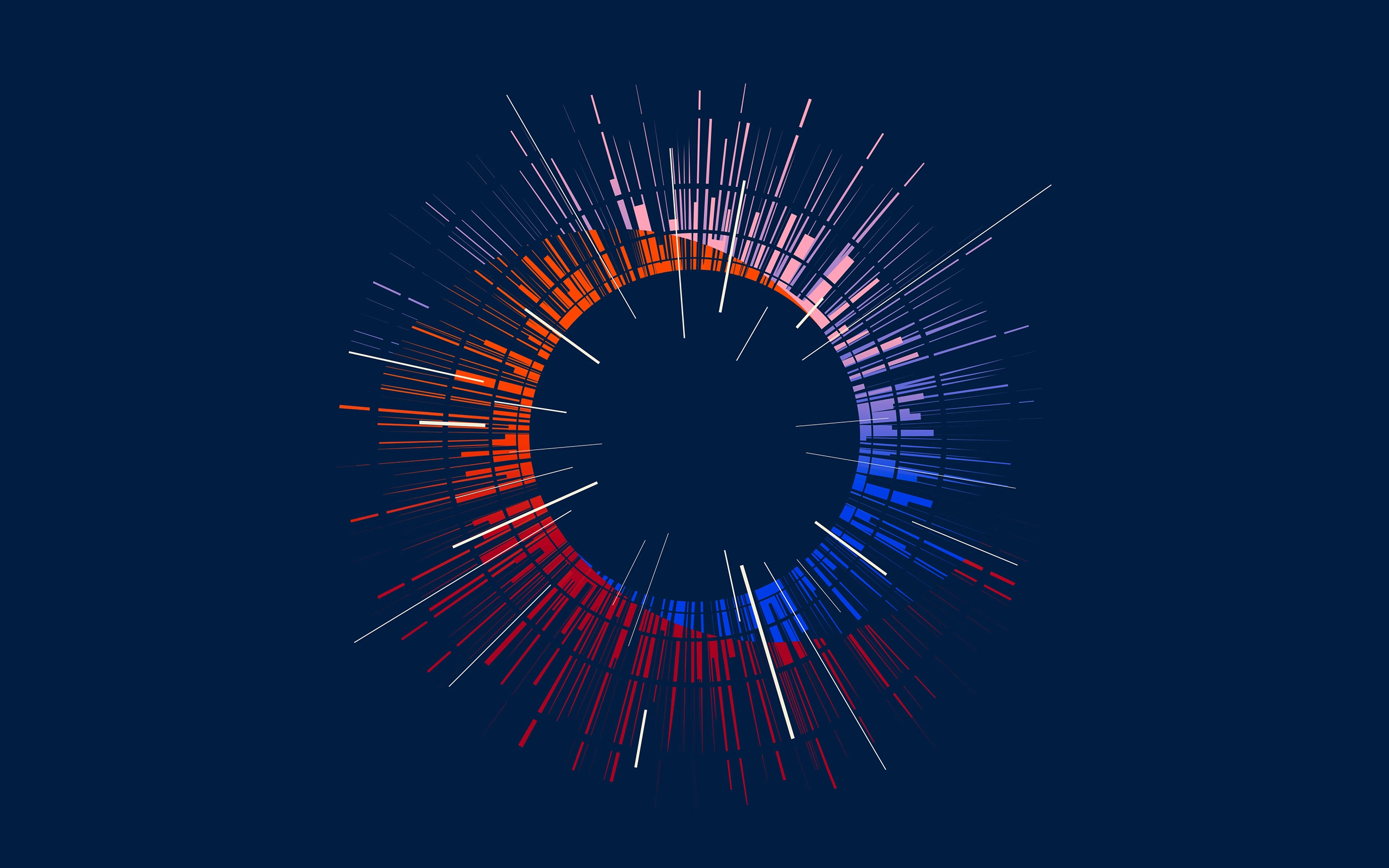
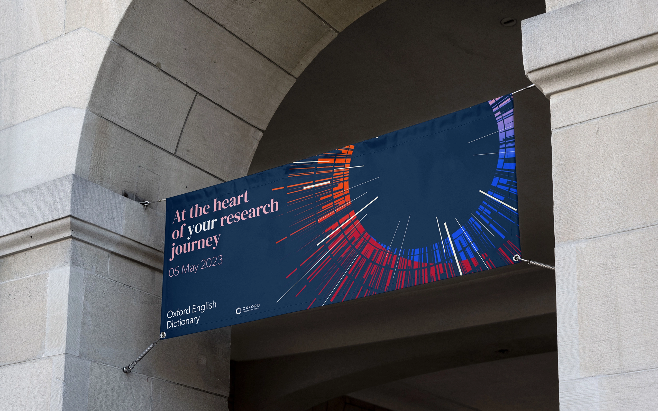
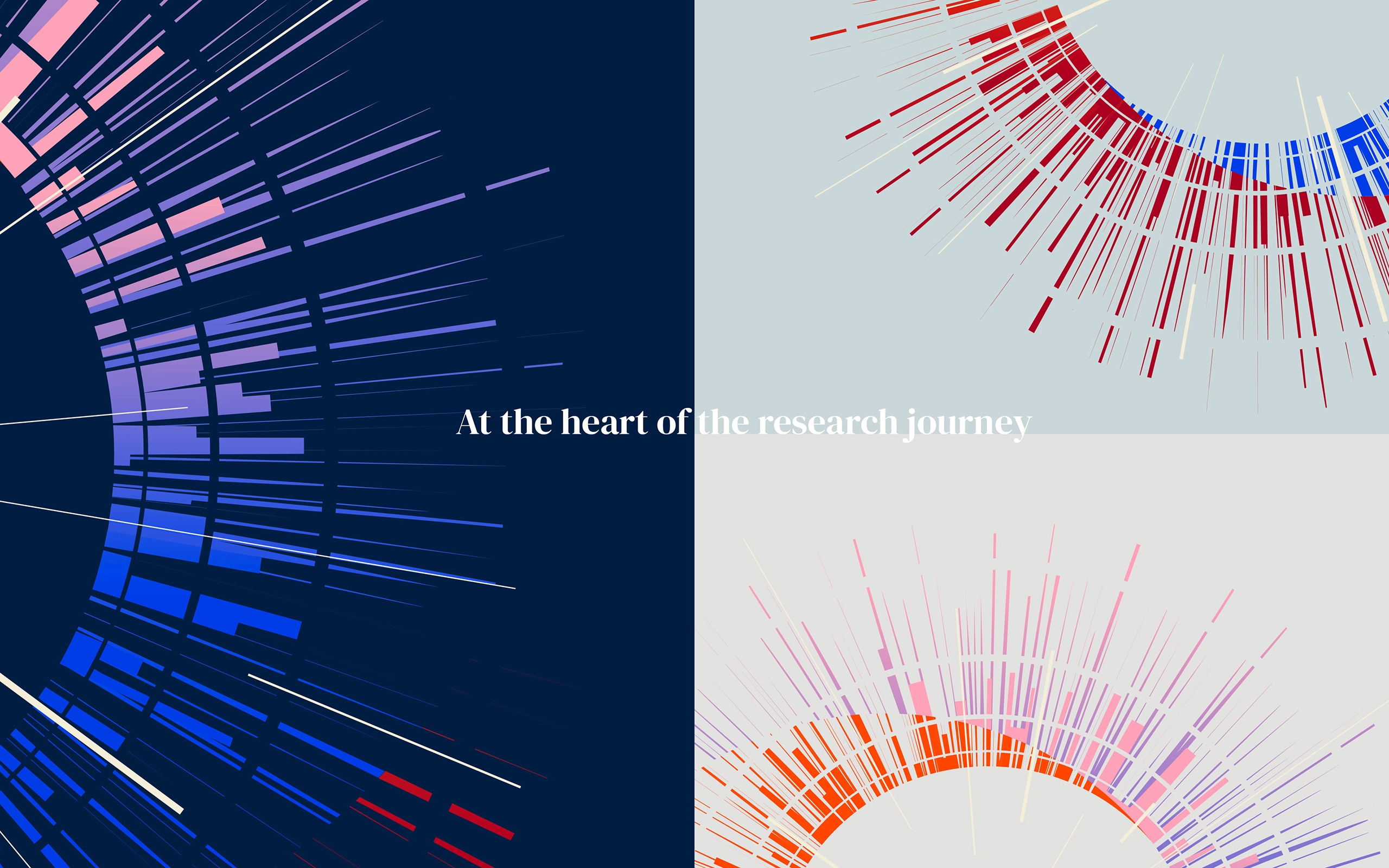
The Oxford English Dictionary (OED) is widely regarded as an authority on the English language. It is an unsurpassed guide to the meaning, history, and pronunciation of 600,000 words – past and present – from across the English-speaking world. As part of the creation of a new online platform, where data is placed at the heart of the academic research journey, a new visual identity was needed to show the enhanced functionality, and relate to the wider Oxford University Press brand.


Read More
Ground Level
The Oxford English Dictionary (OED) is the internationally recognized authority on the evolution of the English language from 1150 to the present day. The OED offers over 650,000 headwords and traces their usage through over 3.5 million illustrative quotations from a wide range of literary and other sources. In order to improve the functionality and user experience the update of the OED web platform is a fundamental change for the users, customers, and internal marketing/sales teams.
The existing platform gives a clunky and dated experience for users, making some of the content in the OED difficult to discover and hinders customers and users in getting the best experience from the product. The OED is full of valuable English language data that can be accessed easily and quickly via digital means, saving researchers time and effort by engaging with the OED in their research journey.
Approaching 100 years old, the current look and feel was also associated with the print dictionary and was time to time to introduce new visual devices to bring the product to life, and illustrate the new functionality.
Elevated Solution
Charting the story of the English language over thousands of years, we needed to challenge perceptions of what a dictionary is, going deeper, wider and further into the meaning of words and their history, unlocking the potential knowledge and data within.
Building on the branding system that ties all Oxford University Press operations together, the ‘launchpad’ for OED was designed to express the historical evolution of words that have come and gone over the history of the English language. It shows the ability to have a quick dive into a specific reference but also a deeper more meandering exploration of rich and proven data. The shape is structured yet fluid and evolving over time.
Ultimately the launchpad brings structure so as not to overwhelm audiences, showing clear paths of research that remain accessible and understandable.
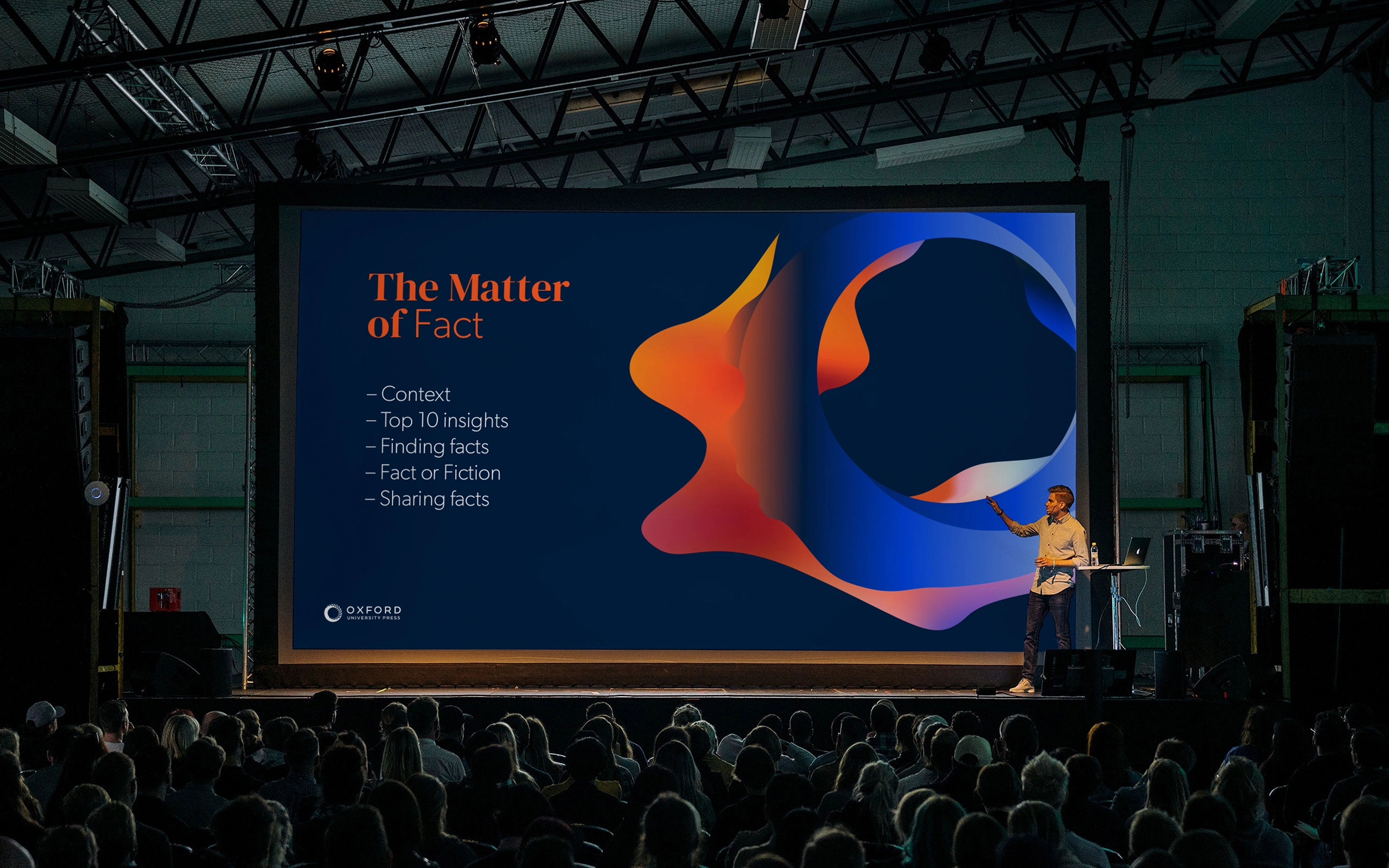
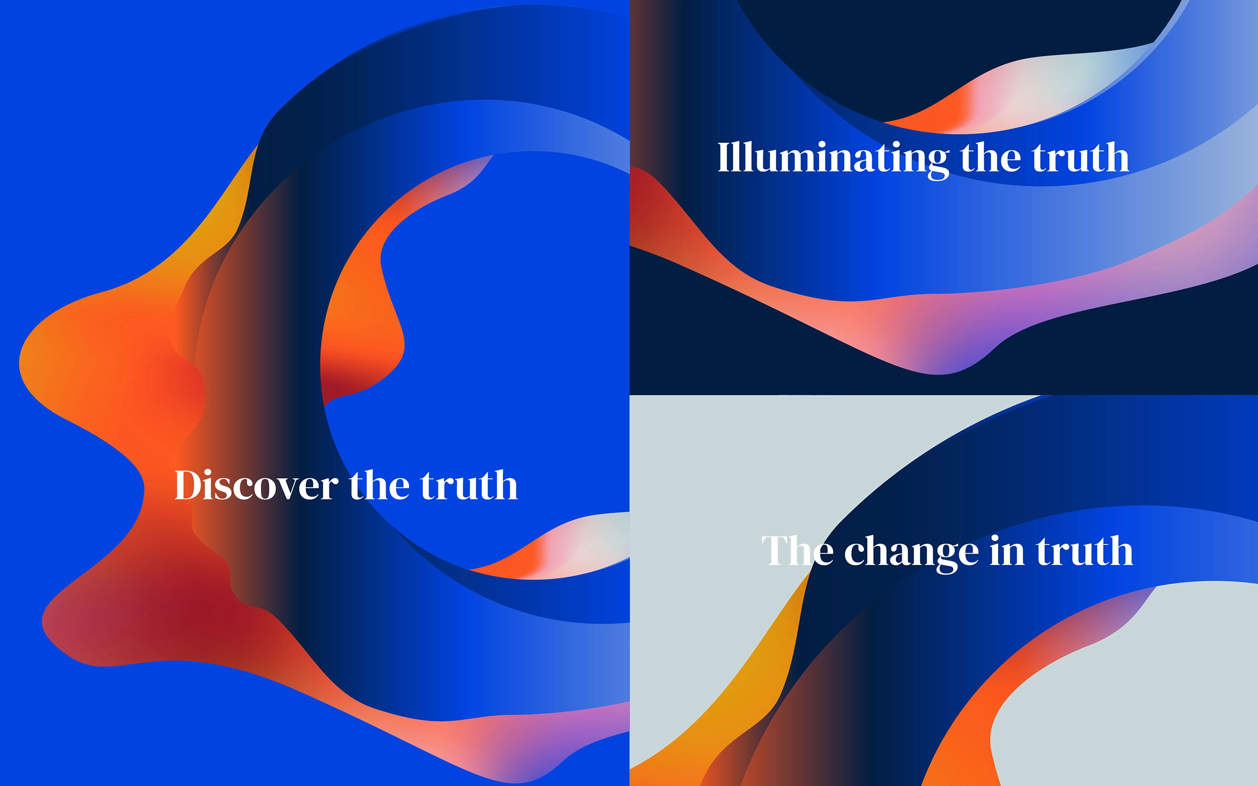
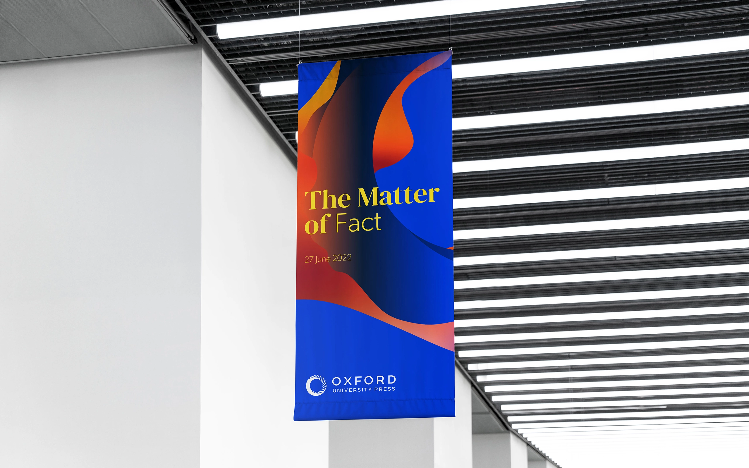
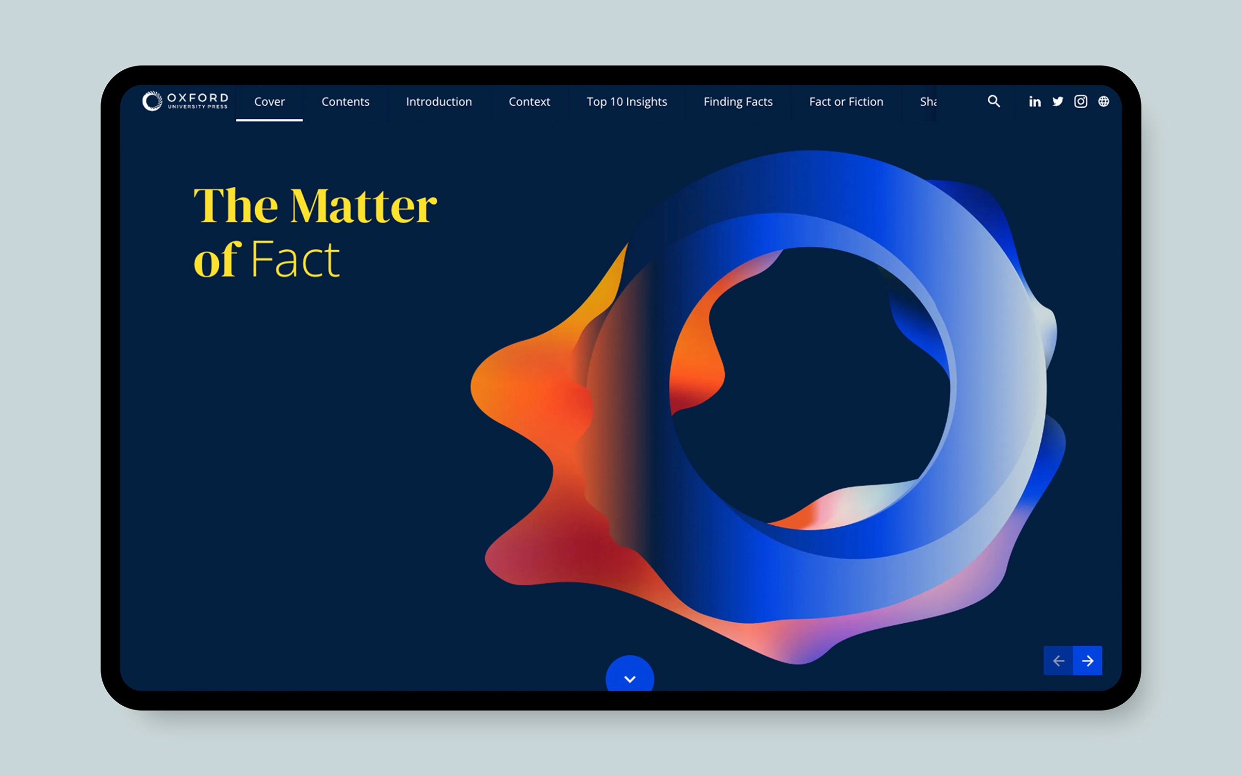
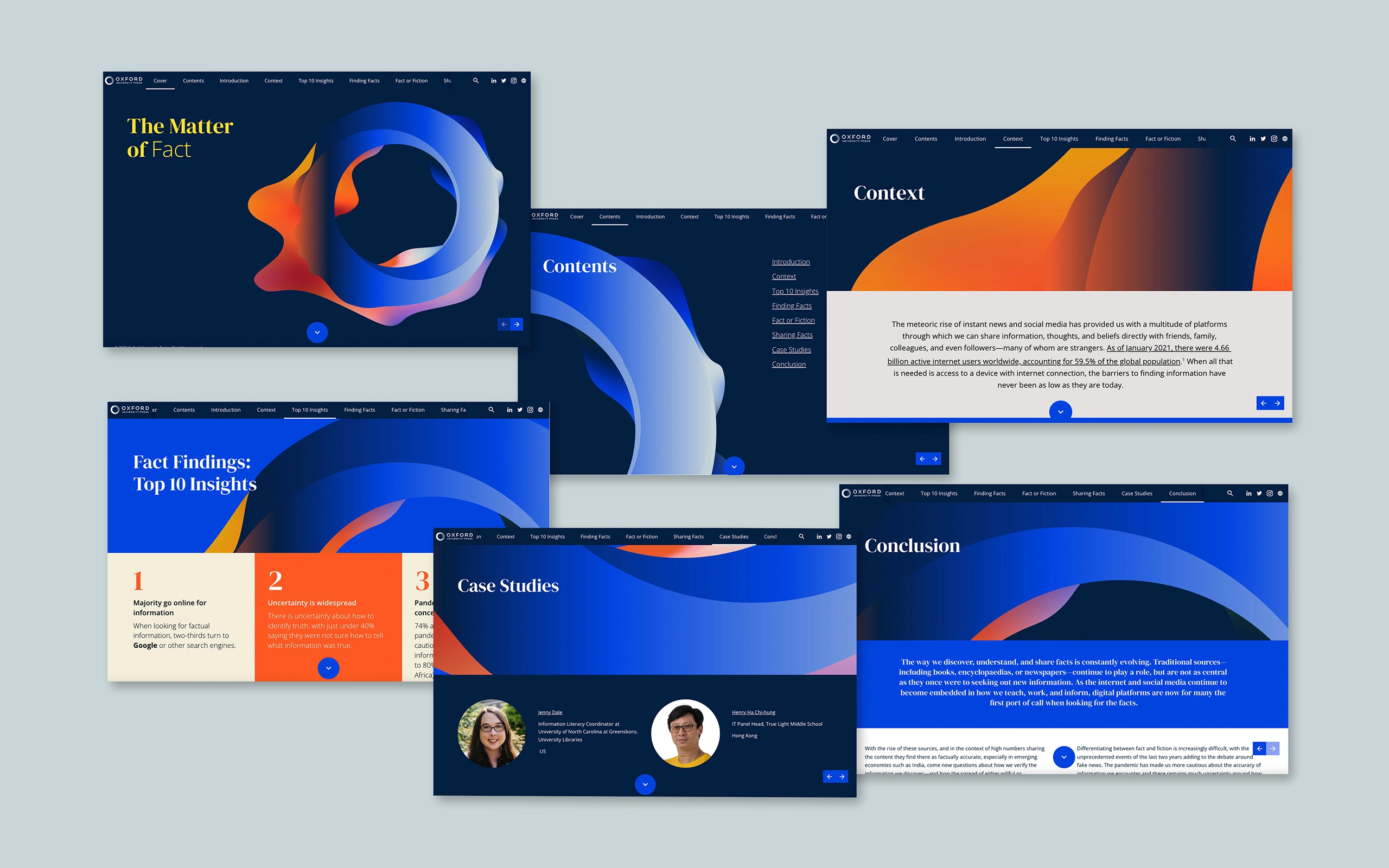
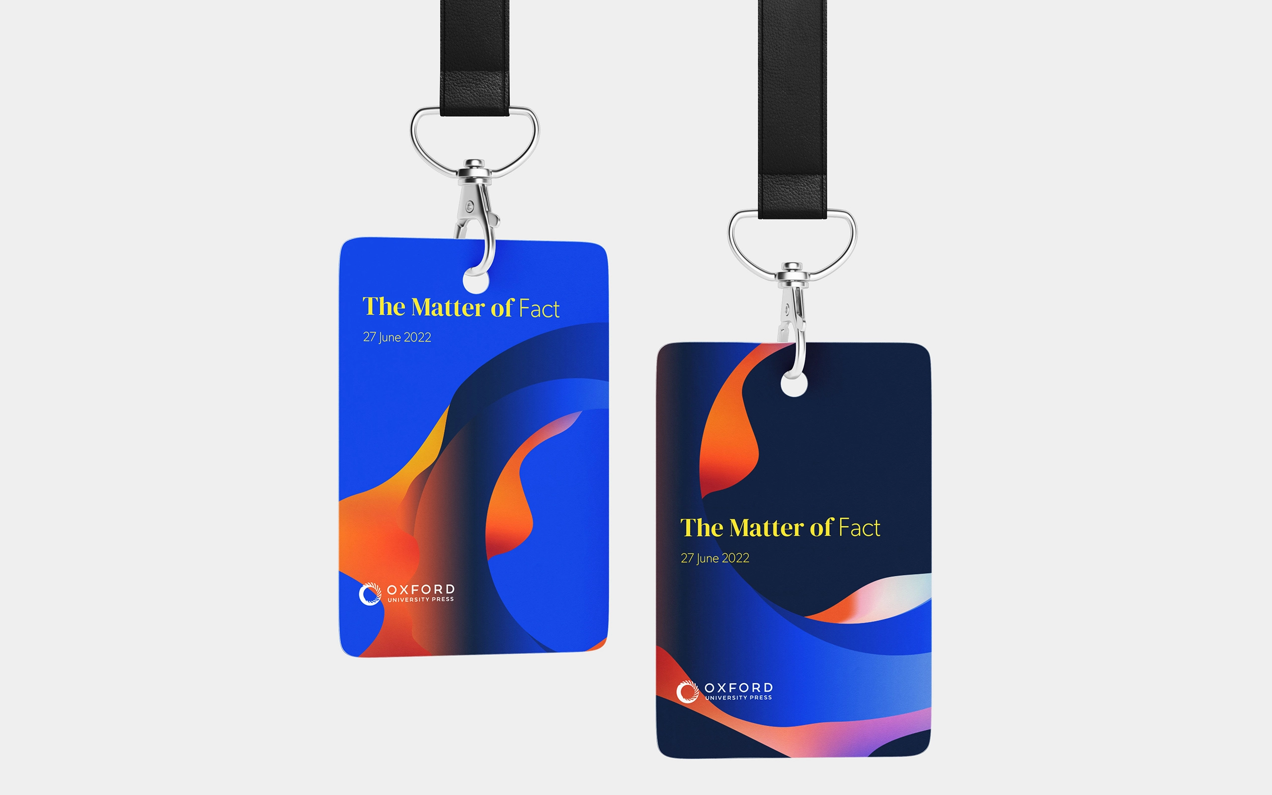
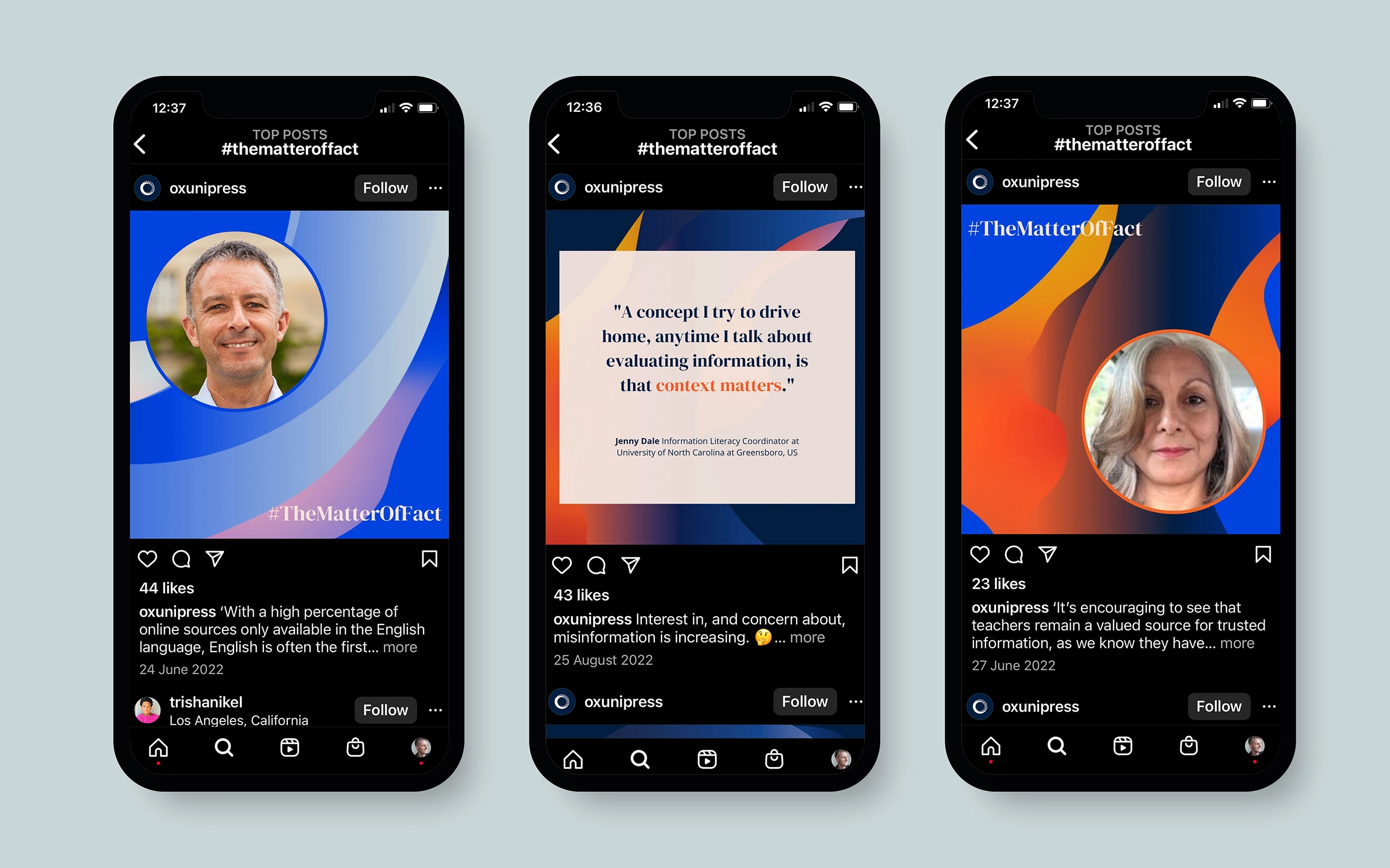
The Matter of Fact
In a world increasingly filled with fake news and misinformation, the truth can be hard to find. As part of a major report, based on a global survey of over 5000 people, Oxford University Press aimed to discover the truth, to understand the truth, and to share the truth. Our task was to create brand assets visualising how the truth changes and morphs over time, fitting within the OUP brand system.

Read More
Ground Level
We live in an age of information overload. Billions of bytes of data are created every second, as we rapidly disseminate news stories, update our social media feeds, publish new books or academic research, and share images and videos of events happening in every corner of the globe. But how do we know what information to trust and where should we go to find the truth? After a period in which the transmission and interpretation of information has been in the spotlight, and questions about misinformation and disinformation more prevalent than ever before, Oxford University Press felt there would be value in exploring the current state of truth in this major new report.
The task was to create a hero graphic ‘launchpad’ that worked within the OUP masterbrand design system and would operate as a visual shorthand for all the communications and activities of the the report publication and promotion.
Elevated Solution
As part of the masterbrand Oxford University Press design system the base O shape of the launchpad formed the structure that changed shape and aspect, reflecting the shifting perception truth. To represent accuracy as well as loose and fluid understandings and manifestations of what truth is, the edges became sharp as well as amorphous and random. When animated, the shapes change from rigid to fluid and back again, representing the constantly changing state of facts and opinion, and inversions.
The ultimate ambition is to empower people to make sense of the world around them, enable authors and experts to share their wide-ranging knowledge and perspectives, encourage open and honest discussion, and give people the tools to interrogate ideas and information with confidence. To have a critical view of what the truth is.
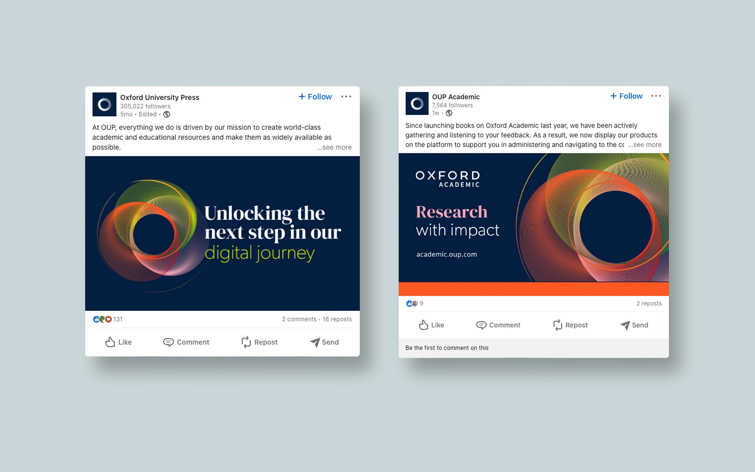
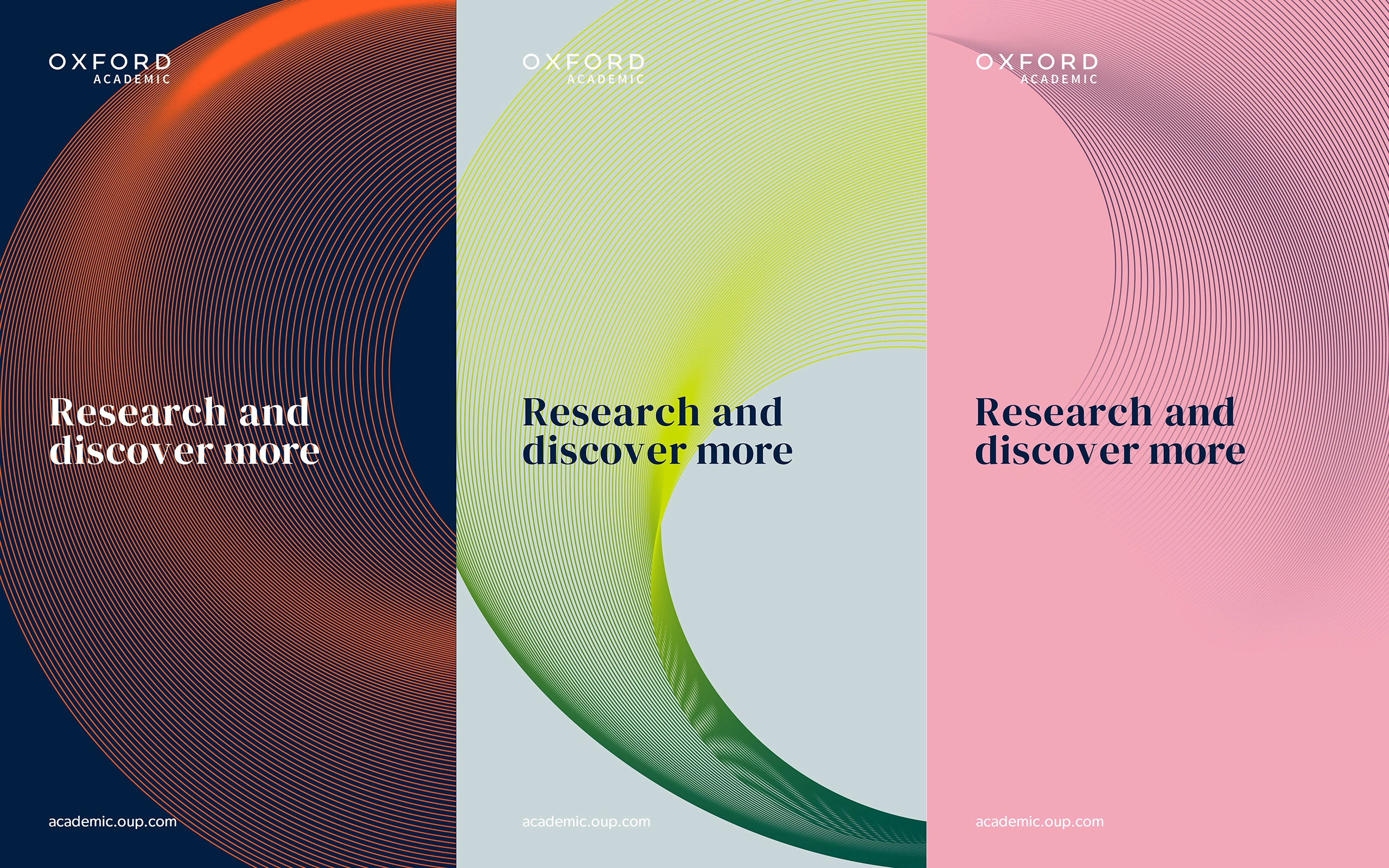
Oxford Academic
In a world increasingly filled with fake news and misinformation, the truth can be hard to find. As part of a major report, based on a global survey of over 5000 people, Oxford University Press aimed to discover the truth, to understand the truth, and to share the truth. Our task was to create brand assets visualising how the truth changes and morphs over time, fitting within the OUP brand system.
Read More
Ground Level
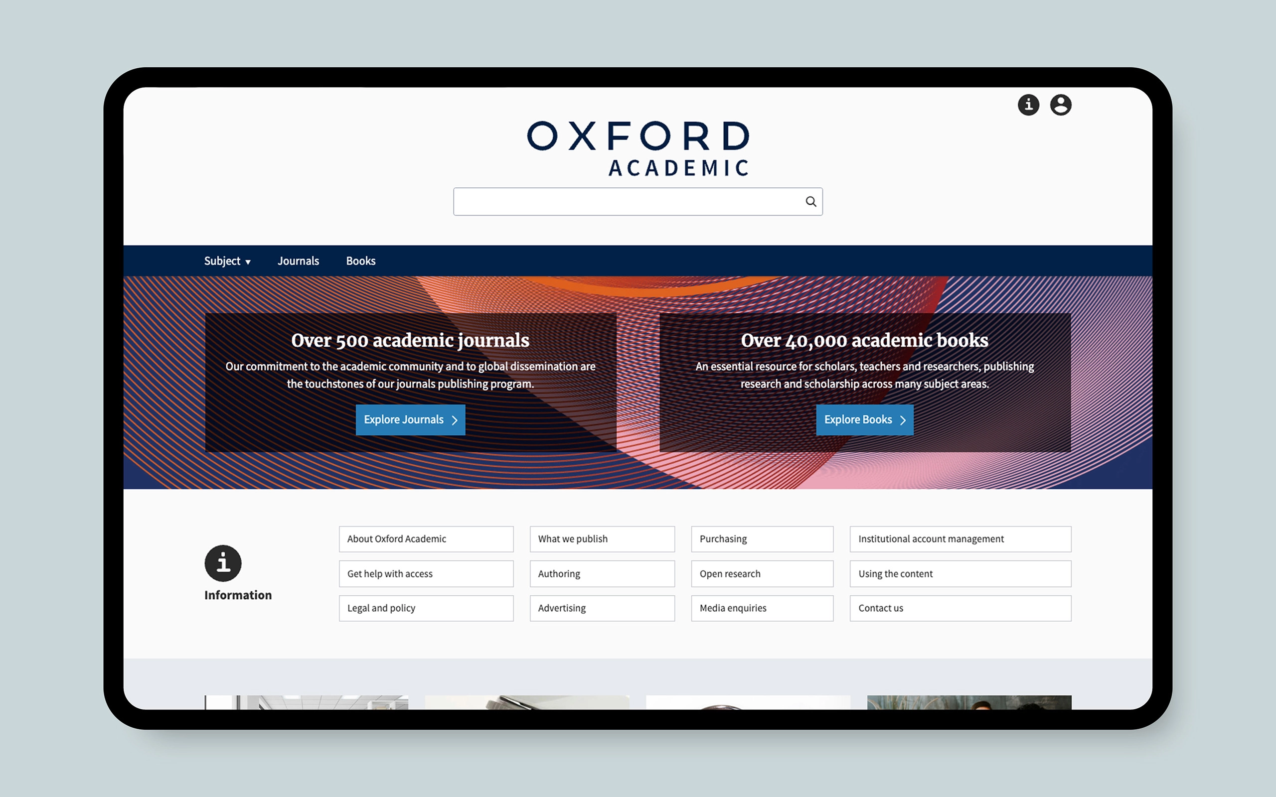
Oxford University Press has a commitment to publishing pioneering authors and authoritative content, and with Oxford Academic you can research, discover, and explore the latest in scholarship from around the world. According to the latest Journal Citation Report from Clarivate, 43% of OUP journals are in the top quartile of their subject categories and six are in the #1 spot.
Oxford Academic has a growing body of three million journal articles, 400,000 book chapters, and two million images and multimedia to meet any research need. Ongoing investments in innovative technologies enable the Oxford Academic platform to keep pace with current and future requirements from the academic community.
The task was to create a graphic launchpad within the OUP masterbrand design system that could be used across all of Oxford Academic’s touchpoints.
Elevated Solution
To capture the seamless, arcing journey that OUP creates for its audiences and users, we wanted to show a clear path through the world of knowledge. This path would take in virtuous moments of overlap and interactions between different fields of knowledge, leading to new discoveries and theories. By using three linear circles that overlap and interact, with a simple path winding into the heart of the resource we can show how the path can be purposeful yet full of opportunity for interaction and discovery along the way.
Click for Contact page